FIELD TRIP!
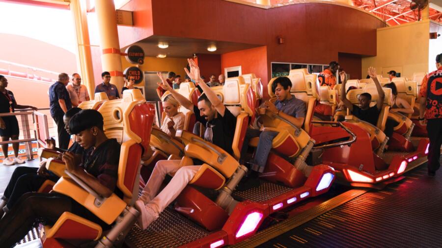
The designers jet off to an exotic location this episode: SKULL ISLAND…. Oh wait. It’s Universal Studios Orlando theme park! Still at least there’s some slightly more palpable inspiration here. As Heidi pointed out, the designers are tired. They could use a pick-me-up. Not to mention, they need something to get the creative juices flowing. One might think that the best challenges are when a designer has the creative “world” at one’s fingertips. Actually, in a competition setting, sometimes it is best to be given a focused “inspiration” because otherwise the brain just wanders aimlessly. Everyone needs direction. Conceptualizing from ground zero can take weeks or months! These guys have to think of something quick, in a DAY! Some in-your-face inspiration can come in handy when you’re exhausted.
The designers take a ride on the new “multi-dimensional experience” attraction at Universal Studios that is Skull Island Kong. Tim makes an analogy of this experience to the “Urban Jungle” and thus delivers the challenge to create a streetwear look. Streetwear is more significant than ever now in fashion, from high to low markets. It is important to be somewhat fluid as a designer, to understand to such trends and stay relevant. From what I saw the designers experience, there was plenty of inspiration. The big question is: how does one capture the “street” vibe in only one day? Let me just lay it down for you. It might seem very simple to do “every day” clothing. But the nuances in street wear take a lot longer than a day to perfect: that understated cool, the slouch, the vibe. It translates to the fit, and this is typically not taught in school, nor is it as “easy” as it looks to perfect.
Laurence said it best: it’s “how you swag it.” She gets it. Translating the current “vibe” in streetwear is something that takes a bit of practice when it comes to draping/patterning. Now that I’ve said this, perhaps you’ll look at this challenge’s entries a bit differently, and perhaps why this week (for me) there were so many that JUST MISSED.
…and what could be a more perfect foray than:
BRIK, who went graphic again (which I want so much to like), but also missed the mark (again) with pattern mixing that did not work. But the bigger issue here is the fact that nothing, ZILCHO about this, says street. It isn’t even close. I don’t understand where the inspiration comes from (aside from color maybe?). The “swag” of the look is totally conservative and “missy,” which is why he was eliminated.
RIK was safe for his all-black look which was “punk” in inspiration. The look for me was certainly not offensive, but I feel can’t fully evaluate his look because I felt like I barely saw it! Rik didn’t get much airtime this challenge.
NATHALIA, who originally chooses faux “Kong” fur for her look, alters her POV a bit after a negative reaction from Tim to the aforementioned. So here’s my take on her final look. I go back to what I mentioned previously about achieving the right “swag.” I understand what Nathalia was going for, but don’t feel like she got there. I wanted to like it, but the pants were awful and the overall look felt sloppy to me, not “cool” (this is that fine line I refer to). I thought this look was wildly overpraised, but it may simply be because the others were just not so great.
LAURENCE pretty much slayed this challenge for another awesome leather jacket, this time in a bomber style and red. It was very smart of her to mix the red with khaki trousers and a dark tee. Though she was her own biggest critic of her “drop crotch” trousers in khaki, they looked better than anyone else’s, and honestly they could have been a slam dunk with either (a) one more day int he workroom, or (b) some stonewashing to relax the fabric a bit (not available to her, just saying!). Nevertheless, this is Laurence’s girl and damn, don’t we all want to be her? I’d wear this outfit and it’s not even black.
ROBERI clearly missed the “urban” memo this week (out of his wheelhouse perhaps?), but there is a very nice ease about the model as she slips the vest off. It is a cool look: relaxed elegance. I’d expect nothing less of him.
MAH-JING described his look as “chic” and sophisticated” which is kind of the total opposite of “street.” The gold dress with short trench-like jacket did nothing for me, regardless of the challenge. I’m kind of surprised he couldn’t have come up with something with a little more attitude.
ERIN created another “miss” this week with an unfinished look which doesn’t feel “urban” enough. She was trying to do something painterly with her embroidered technique this time (which, by the way, is getting old), but it just looks messy. I can’t imagine any woman wanting to wear random chunks of shagginess on a pair of flannel shorts. The top/jacket had something interesting at the heart of it, but there was a disconnect between it and the shorts, and her fabric choices are very perplexing.
DEXTER thought he had been in the “safe zone” too long so he went a bit overboard and created something pretty wackadoo. For me, the color choice was the *only* redeeming element to this look. OK, maybe the hair and makeup styling too. Aside from that, I really struggle to find anything great about this design: it’s costumey and ill-fitting. I don’t care for the shoe selection but I know from experience that as a contestant you usually aren’t going to find your dream shoe on the “wall.” Nina hit the nail on the head with her “Military Mickey” analogy. Who knows what sort of score he had, because the judges seemed to be split on this.
CORNELIUS thought a pop of color would make his look stand out. Perhaps if had fit better it could? Wait, who am I kidding. The whole look was dated and ill fitting all around. I am trying really hard to see something redeeming… MAYBE if he had done the jeans with a cool black crop top (and jacket?) I could see it appealing to the risk-taking Alexander Wang customer. However, merely the fact that he thought his look was “haute couture” is enough to pretty much flunk this guy. Please tell me his days are numbered.
JENNI was safe with her sporty ensemble. While the proportions were good and the sport influence is still very much on trend, there was no “wow” or “swag” happening in this design to propel her into the top.


