Now this is an interesting challenge. And harder than you think, I might add. It’s a new spin on “day-to-night”: the designers must create a look which is equally effective under daylight and (“night”) blacklight. Sadly some designers could not help but (even at a subconscious level) go to that “rave” place when they saw a blacklight. A dash of that could be ok, as long as the look is still elevated and fashion forward. The line is oh-so-fine though. It is definitely an odd challenge but it does stretch the imagination… and with challenges like this, you can really see who doesn’t have much imagination.
As much as I am annoyed by these obvious “sponsor” challenges, using Transitions Optical lenses as a metaphor and “inspiration” for a look that transitions from one type of light to another is pretty clever! But wow, shameless promotion by Tim! To help the designers make smart choices in fabrics, they are given blacklight flashlights to use at Mood, and thank goodness. Blacklights are tricky and sometimes things that one thinks will glow don’t at all, whereas some fabrics or colors completely transform in unexpected ways.
Mah-Jing makes the dreaded (very touching) call home to his daughter on Father’s Day. All I could think was that this is the kiss of death… and then to see him emotionally distraught throughout the episode and his work suffer was sad to watch. Let me just reiterate how difficult the experience of competing on “Project Runway” can be. Some of you know this already but some don’t. As a “contestant” you are stripped of everything that is familiar to you—books, music, phone, and even your wallet and identification. You cannot make daily calls to loved ones, and when you are allowed to call (maybe once or twice a week), it is for a very short time and while being monitored by a chaperone. What’s more, everyday things like foods you like (for me it was also decent coffee), your bed… gone for five weeks. It’s a longer time than it seems. This creates feelings of being unsettled and insecure. Then imagine getting little sleep, sharing your living space and then the obvious pressure of each challenge and being critiqued by the judges, not to mention millions of viewers! I just wanted to remind you, just in case you forgot how much of a pressure cooker it is. I felt badly for Mah-Jing. Everyone handles the experience differently. In a way one must become numb emotionally in order to survive the bubble of the competition. I did. And then I had a bit of PTSD when I got out.
CORNELIUS earned a high score for his “emoji” art painted onto a white dress. While there was a great element of surprise (which the judges love on the runway), I did not find the artwork attractive. The designer Jeremy Scott came to my mind when I saw it, but not at all polished. It looked like something a first year art student would do, or someone would make to go to Burning Man. Also, why didn’t he do the back of the dress? I would not have put this look in the top three. Can we talk about what a sore loser he was?! Not cool.
JENNI’s hand painted clear plastic jacket also earned a top score. For her fourth attempt at this challenge, she paired it with a lemon yellow bodysuit which had a vintage cut. It had great runway appeal and her henna-inspired flowers were nicely executed. She could not anticipate the fact that they would peel off though, which could have been a happy accident?. It’s hard not to think of “Blade Runner” (one of my top five films of all time) when you see a clear plastic raincoat over a bodysuit, but the neon paints in floral designs shut that down immediately. For me this was more appealing than Cornelius’ look but still felt rave-y because of the bodysuit.
ALEX designed an odd color-blocked asymmetric blue and pink dress. While I see his POV in the dress, it came across as rather underwhelming (as he said himself). The colors became a bit more intense under the black light, but without the black light the dress misses the mark.
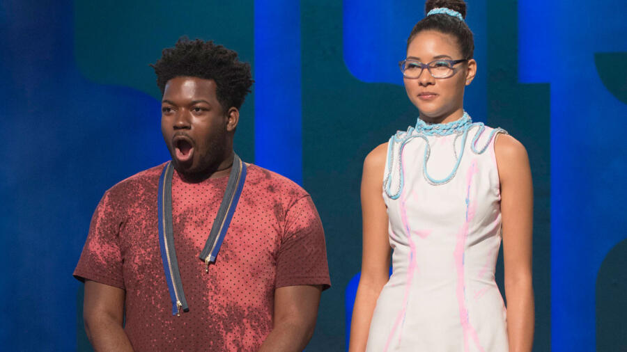
MAH-JING’s struggle was real, and it was reflected in the outcome. Like the judges, I did not understand the concept or execution of this dress. He also had a mishap with the pink paint, thinking it was not going be visible under natural light. The odd splatter of the paint looked more like a “crime scene” and did not make enough of a statement. Perhaps he could have pushed that farther and/or used a bolder paint color like orange. I also did not understand this odd braid that he made to trim the dress. Again, it did not make a strong statement and was confusing. Mah-jing was in the bottom two but spared. Hopefully next week he can get his mojo back.
NATHALIA also used turquoise and hot pink color blocking (similar to Alex), but added sporty white mesh which then turned blue under black light. It was just (she was safe), but hopefully she designs something more than a sport look for the next challenge.
ROBERI’s textural, sculptural dress was my favorite of this challenge. I am dumbfounded as to why he was not a top scorer in this challenge. The judges deemed him “safe.” The look was successful in natural light and even more so under blacklight. I love that it was a subdued color at first and then under blacklight had punch. It completely transformed from a pale dusty grey/ mauve to blue and hot pink! The clever use of the threads from the textile’s raw edges looked like marabou feathers. This is a dress which could actually be worn and one would not look like she is going to a rave or stuck in the 90’s.
KIMBER got the boot for her half-floral dress which missed the mark in terms of a transitional factor. It wasn’t great in either light. She had the blacklight at Mood yet chose a fabric which lacked any sort of transformative characteristics, so she had to then apply paint on top of it (which also was not impactful). There did not seem to be enough effort here. I read through Kimber’s bio and she had studied art but has only been practicing fashion for three years. I feel she needs more time to develop as a designer.
SARAH keeps slipping under the radar with her rather safe, simple, underwhelming designs. The demure schoolgirl look is getting old. There wasn’t much to her design again this week: just a plain black base with some white textures which popped under the black light.
RIK’s dated, 90’s nightclub look was a low scorer. Under regular light it just looks tacky, and under blacklight it’s all about the “cheeky” neon lacing; the skirt is also quite ill-fitting. This entire ensemble does make me question his taste! No bueno.
LAURENCE had immunity this week but was safe for her very French boy-brief-with-blazer ensemble. It was disappointing under the blacklight with very little transformative qualities. On its own, I suppose the look has an editorial appeal, but I would have preferred she pair it with a cool pant or skirt.
TASHA’s black and pink ensemble was all about the neon suspender straps and stripes in the skirt. For me this was again a bit dated and too “ravey,” lacking fashion, especially in daylight.
ERIN took her second win with a metallic, diaphanous, feminine dress that she hand beaded. Under the blacklight it took on an “outline,” almost as if lit by pale blue neon. I think she did a great job by NOT making an outfit suitable for a rave. I must say I was concerned about her obsession with nipple pasties. (I think Tim was as well! His reaction was priceless) In my opinion it worked in her favor that the emphasis on them was obscured by her embroideries. Clearly Erin is now a major (early) contender for the finale. She has made a very strong impression on the judges. For me she definitely has one of the most distinct POVs of all the designers.
BRIK ended up safe this challenge, but his dress did not embrace the challenge at all. He was likely rattled by being in the bottom for two challenges so it seems evident that he made a clear decision to play it safe this time. The dress was just okay—at least it had an interesting shape, slightly futuristic; but it barely changed under the blacklight.
DEXTER used fringe to create “electrical” movement, which was quite fab under the blacklight. His look was all white but interestingly took the blacklight differently due to the varied types of textiles and fiber content. He was safe again but if it were me, I may have given him a higher score than Cornelius.


