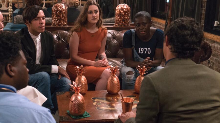
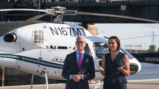
The designers are invited to a PR 15 press party–so they think–at a swanky lounge/club in New York City, where they get to rub elbows not only with bloggers and media, but also with the judges! People always ask me, “What’s Heidi like?” (or other judges for that matter) or, “Who’s your favorite judge?” I do my best to reply sincerely, but in the end I tell them, “I don’t really know. They keep their distance.” Well I’m sure they are still keeping their distance figuratively, but the fact that the designers get to shoot the s**t with them over cocktails (albeit while cameras are rolling) is leaps and bounds over anything I’d ever experienced.
Alcohol sponsors are always a good thing in my book. Who doesn’t love a cocktail? And kudos to the PR team for getting a status brand like Absolut, to step up the sponsor game. Apparently Absolut has a new, “handcrafted” (i.e. luxury) vodka called Elyx, along with a namesake club in New York. It is here that the designers are all handed awkward giant copper pineapples with straws and some sort of libation inside, to carry around all evening. Furthermore (just when they got their buzz on), a challenge is announced (buzzkill): design a luxurious cocktail look inspired by Elyx. At least they can sleep it off and enjoy the party. It will be GO time tomorrow!
Feeling relaxed, the designers start to draw inspiration–literally or figuratively–from their surroundings. Erin digs on the flamingoes in the powder room. Laurence finds the perfect lounge spot on a tufted leather sofa. Rik fancies the bartenders the most inspiring in their leather aprons. Nathalia is wooed by crystal chandeliers. Mah-Jing has a vice grip on his signature pineapple. Perhaps a few cocktails in, he is literally inspired by the sweat running down his drink vessel.
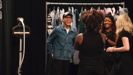
The designers have a whopping $300 to spend at Mood this time. Mood has some pretty amazing luxury and embellished fabrics so it’s nice that they at least have the option to use them this time. It is always very interesting to see how designers spend their Mood money, especially when given such a short time in the store (some are familiar with the layout and some are not)!
LAURENCE’s dress is pretty perfect in my book. Not only did she translate her inspiration perfectly into the garment, but her POV is evident (Nina said she knew it was hers when it walked out), and it looks LUXE, a key element of the challenge. Sure it’s a LBD, but it has dimension, texture, shape, and a great fit: the “Bentley” of black dresses. The back is to die for, fit is on point, and the construction details are well executed.
RIK earned a high score for his pumpkin spice-colored leather apron-inspired dress. While I appreciate the inspiration outside the box, for me this doesn’t necessarily feel luxurious or cocktail enough except for the fact that is made from leather. The black buttons give it a retro feel. I also think a longer length would have felt more dramatic and hence more luxurious, and less “junior.”
JENNI took the winner’s seat this week for her vintage speakeasy-inspired embellished shift. How coincidental that the judges (especially Heidi) called her out on “copying” Erin’s signature “embellishment” style, when they supposedly don’t know what happens in the workroom? This “story line” was just a bit ridiculous and staged…sorry. I felt that while the overall effect of the dress was good, it seemed a bit poorly executed for such a simple shape. The wonkiness was masked by sparkly embellishments. I feel a bit like the choice for her to win was a producer call based much on the fact that everyone thought she was plagiarizing Erin’s signature style.
ERIN ate a piece of humble pie in this challenge, which in theory she should have rocked, being that she is the “embellishment queen.” I’ve always been pleasantly surprised at Erin since Day One, because I had always thought her work would be a bit looney tunes. Well, it might be coming out now. There is a fine line between good genius and bad crazy. I think Erin’s POV walks that tightrope. Not to say too much creativity is a bad thing–I just hadn’t taken her as someone to gloat. Anyway: brocade, feathers, reflective, embellishment. The girl can’t stop!
TASHA was completely out of her element, missing (or not understanding) the “luxury” note, but was a trooper for getting though the challenge. However, she went from crazy idea to zero idea. How denim and floral is luxurious and cocktail is beyond me. And beyond Tim, apparently, so she scrapped all that and had nothing left but black ponte, which she made a super simple black dress out of, and swaggered it with a sequined scrap around the waist. The judges almost always choose creativity over a complete lack of design, so between Nathalia and her, Tasha got the boot.
CORNELIUS clearly has a thing for houndstooth. But who picks the same fabric TWICE on “Project Runway”!? Especially such a distinct one? Where’s Isaac when you need him? HE may have appreciated it…
NATHALIA was drawn to the chandeliers at Elyx club. Unfortunately her translation into a garment became a bit Ice Capades. After Tim’s critique she went more 1920s, but the result felt like a “Made in China” moderate beaded dress, and though her fabric was undoubtedly expensive, the execution made it look cheap. Also this overall aesthetic for Nathalia seemed very incongruent with everything else she has done; it makes me question who she really is as a designer.
BRIK went glam rock, color block with black and pewter. His dress was noting ground breaking but certainly not horrible, and the fit decent. He strikes me as a designer who doesn’t quite have a handle on what “luxe” means either. Nevertheless his look was safe.
MAH-JING took the dripping sweat from his pineapple and had initially draped a red dress with literal “drip” shaped hemline, which translated more as blood or paint than sweat on a cocktail glass. Fortunately he decided against this in his final design, but the result was a red dress with dated sweetheart neckline.
ROBERI made an odd fabric choice. On screen it looked a bit casual. Perhaps in person it felt more luxe? My interpretation was “arty Miami.” I love Roberi’s artsy POV, but he needed to turn up the luxury in this challenge. Ironically some of his previous work would have been better suited.
DEXTER thought he and Erin would slay it in this challenge (Will they become the means girls?), but the judges weren’t buying his chocolate fringe dress. I liked what he was doing in the workroom but not so keen on the final look. It certainly bordered on hoochie, and again needed something else to feel luxurious. Perhaps some leather accents or another material. Dexter was warned that he had received low scores but he had immunity so was safe.


