Hooray, finally a challenge that just feels like a straight-up “design something fabulous” type of challenge! Okay, so this one is sponsor-driven as well. However, we all know Marie Claire because they are a title sponsor of the show, and after all, it’s a fashion magazine. It actually makes sense that a fashion magazine drives the challenge as opposed to yogurt or a burger restaurant or a lens crafter, don’t you agree?
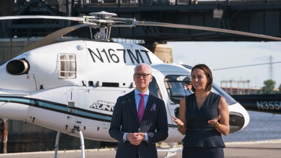
Editor-in-chief Anne Fulenwider tells the designers they are to design a “powerful” editorial look for an empowered woman inspired by the breathtaking aerial views from of New York City. I must admit I was very envious the designers got to take helicopter rides, something on my bucket list! I’ve always found aerial views to be incredibly moving, humbling and inspirational. The winning look will be featured in a spread in Marie Claire.
I can tell the designers are getting tired. It’s the top eight and this is usually a point in the competition (about halfway through) when there are creative road blocks and meltdowns and such because the pace and environment are so stressful. Other viewers might not see the signs as much as I do since I’ve lived it. In this episode in particular, I felt much of the creativity dragging. That said, designers are only given one day to create something which is expected to be highly conceptualized, and honestly that is half the battle. Constructing the garment can obviously be quite time consuming, but something conceptual takes time to “marinate” and brainstorm. So let’s face it: when one only has a single day to design and fabricate, it’s never going to live up to anyone’s expectations, and even I (having been through the process) find myself critiquing these designs and thinking, “It could be so much better.” Once you come up with your sketch/design, you basically have to commit to it at that moment and GO, GO, GO. There’s no time to spare for evolving the design or changing a whole lot. Then you buy your materials and that’s another commitment. As we’ve seen, if you make a mistake, you’re kind of screwed, and if you have to start over, the design is almost certainly going to be weaker and more watered down simply because you’re trying to beat the clock.
DEXTER got the boot (shockingly, a second elimination tonight) for his “goth,” Marilyn Manson- esque look, simply inspired by the “darkness” of New York. The look was simply too costumey and those silly shoulders too similar to his previous look, which the judges also called him out on. On the one hand I appreciate the “outside the box” thinking, but he could have come up with something different and more sophisticated. It looked like an outfit a goth girl sewed at home for her night at the club. There is a way to do editorial goth–this look needed to be more elevated.
NATHALIA was the other victim of this week’s surprise double elimination, though it came as no surprise to me. As I mentioned last week, I feel Nathalia needs a lot of growth as a designer. That became even more evident in this episode as she leaned on Rik for advice at every turn, since Jenni was no longer there. When she said she was going for a “superhero” look, right away I recoiled and saw it as a bad omen. I got the feeling she doesn’t even really understand the idea of “editorial.” Sure enough, her first go was too literal and the second go was neither interesting nor edgy and poorly constructed.
ROBERI’s look this week was disappointing. It was a pretty enough dress, but just that. There was nothing editorial or powerful about it: the ruffles, the color…nothing. I thought when he explained his inspiration as “flying” he would come up with something more sculptural perhaps.
MAH-JING produced one of his best looks to date. This awesome dress checked both the “powerful” and “editorial” boxes. Love the use of texture and color, and the fit was great. And the graphic components completely reminded me of an aerial view.
CORNELIUS really concerned me at first with his selection of rainbow leathers. Not quite sure where he was going with that at first, but where he ended up making a perfectly cute and interesting dress. However, for me, it was not editorial or “empowering” enough to be a winning look. The hair/makeup styling was great though and helped elevate the look.
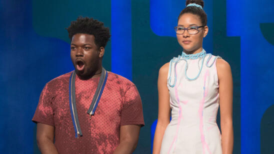
ERIN came up with yet another left field look. Her first look, a pastel petal pink coat with wavy edges, was even more far fetched. She clearly has a quirky imagination and marches to her own drum. Obviously Tim’s harsh critique was a bit of a wake up call, however I was not at all impressed by her final look, a dress with a giant ruffle. She made a deeply positive impression on the judges early in the competition, but has been in the bottom four times now. It will be very interesting if she continues to skate by into the finals.
LAURENCE’s look was quite a departure from what I grew to love and expect from her. I felt her dress was ironically LESS powerful than other looks she has done in previous challenges, and that she lost her way a bit by trying to go outside the box. The textile choice for the skirt looked interesting but I would have liked to see the tougher and sharper side from her for this challenge.
RIK, inspired by the Statue of Liberty, seemed to have a clear vision of what he wanted for this challenge. He painted fabric with a black inky splotch pattern to have an edge. The final result, a draped dress, was a wow moment when it walked out. Many of the judges felt it looked unfinished and half-assed (pun intended) from the back, but I knew it was intentional and was part of what made the look editorial and slightly avant-garde. It reminded me of Margiela or Demeulemeester (Google it). Rik’s design was my favorite and I felt he should have won. But hey, fashion is subjective.


