Can you believe it’s Season 15?! For me personally, it is hard to believe it’s been 8 SEASONS and 7 YEARS since I competed! Did anyone think “Project Runway” would still be going? I hate to say it but after a while all the seasons start to blur together…
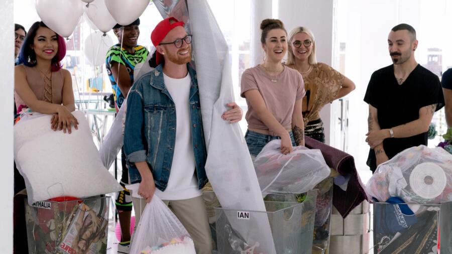
I guess the producers were thinking, “How can we really start Season 15 with a BANG (and top last season)?” Well, in Season 14 the unconventional challenge was in Episode 2 (already quite early compared to when it comes up historically), so *boom*, they thought they’d give the designers a real run for their money and make the first challenge an “unconventional” one. As if that wasn’t enough to fill those fresh faces with anxiety, sweats and a sleepless first night, the producers pulled a really wicked move and made the designers think they were simply going to a meet-n-greet “launch” party and got them liquored up on Moet! The designers were all socializing and getting to know each other and then Heidi and Tim walk in, all business in their collared shirts and pinstripes, announcing that their challenge will start…NOW! Talk about a buzzkill.
The challenge: to use the existing party decor and capture “the spirit, aura and vibe of the launch party.” Is it me, or was the party decor selection kinda lame? I guess we can only see what they show us on on our screen, but I was thinking it did not look like much was there. The designers have five minutes to scramble (and fight over) those precious fake flowers and toothpicks, and then only one day (until 9 pm) to work. Wait, what time were they drinking that champagne – 9 or 10 am? Typically that’s what time we started filming! Lordy, if I’d had glitter, balloons, fake flowers, and Mood shopping bags to work with, I think I’d be kinda cranky.
Speaking of glitter, in the workroom, Brik from Baton Rouge professes his obsession with glitter and henceforth, a theory on why humans like shiny things. He proclaims he will make “glitter-covered bell bottoms,” which for is an instant red flag. Alex, who owns a company at age 30 and also teaches, will take on the role of mentor this season. It is noble that he so readily wants to help and advise others, even if they are his competition. I wonder how this will unfold throughout the season. Ian has blatant disregard for Tim’s critique. (Fair enough, you can take a critique or leave it.) Something tells me this is going to bite him in the bum. Nathalia is designing “Bride of Tin Man.” Tasha has to recut her drop crotch pants for the fifth time after Tim’s advice. Erin seems to be designing a dress inspired by Big Bird in drag. She has a pretty “laissez faire” attitude about her time management as well. Splicing hundreds of gumballs, after all, must be quite time consuming!
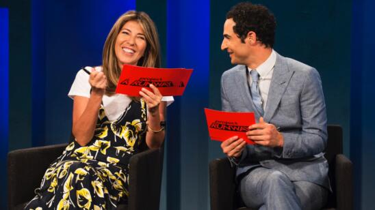
The runway in general certainly had the “party” vibe, but I’m having a really hard time with the fact that a “Today Show” co-anchor is judging (a) the premiere and (b) an unconventional “party” challenge. I personally had never heard of Savannah Guthrie because I do not watch TV in the morning. I have consistently had issues with the choice of judges on “Project Runway.” Just because one is a “megafan” doesn’t mean he/she is qualified to judge! Is a “Today Show” co- anchor really an expert on fashion? (Sad face.)
MAH-JING’s “basic” silhouette was safe, as it should be. He took the easy way out by building a simple dress in muslin and then sticking a bunch of crumpled papers onto it. But I have to say I liked the overall textural effect.
JENNI used “backpacks and boas” (sounds like a new reality show) to create a rather unappealing ensemble which she proudly hand-painted. I can respect the effort but the color combination was just fug. It looked like an outfit from the clearance rack at TJ Maxx.
SARAH was safe with her forgettable crop top and skirt made from candy wrappers and paper lanterns. All I could think was it looks like a nine year old designed it and nothing new.
Have to say I am not a fan of NATHALIA’s general “rave-a-licious” aesthetic (based on her portfolio), but she did a good job with this look, made from placemats and fake fur pillows… if Katy Perry was the client. It’s an effective stage costume, but not particularly fashion-forward.
DEXTER was in the top (or was it the bottom?) with his throw rug and pillow creation. I like the graphic bodice, but could really do without the fur sleeves. I think the look would have been more successful had he left it sleeveless.
RIK used undeveloped Polaroid film and backpack straps to create a modern and clean look, but nothing ground breaking and lacking a distinct POV.
IAN was eliminated for his “embellished minimalist” dress. I have to say I disagree with his elimination and kind of liked this dress—it reminded me of Phillip Lim. I can appreciate the minimalism and don’t think it was a cop out. Tim suggested he add “volume” to it and even though Ian came across a bit bratty, I think he had a vision and by adding more trims and fringe and stuff, it would have been less intentional. Ian should have been safe, in my book.
I really like TASHA’s approach as a “designer for women who don’t wear heels,” and was very intrigued to see what she would do in the first challenge, but sadly for me it fell very short. I was very surprised she was in the top. Perhaps it was because she made separates and a different pant shape? Who knows. Maybe it looked better in person. I thought the pants were unflattering (and I love me a drop crotch pant), and thought the top was incongruent with the bottom. Still, glad she is in because I want to see more from her.
Big Bird for the win! ERIN’s look came together at the eleventh hour, and stole the judges’ hearts. I’m still not a fan of this look (suited for Katy Perry or Miley Cyrus), but it does have a runway appeal and is well-constructed. Personally I would have not given her the win. This former Mormon girl definitely has a free spirit!
LINDA created a successful, sleek, slightly futuristic look from balloons and lamp shades, and is safe. I love the fact that it is all white but has a lot of textural interest, and fits really well.
KIMBER, who got virtually no airtime, used placemats and bags to make a rather lackluster (safe) gold a-line dress. It was neither here nor there.
LAURENCE used toothpicks, tote bags and beads for her mini dress look which felt very current yet forward. This look resonated with me because it felt the most “ready to wear” of all of them. Not for one second did it look like a costume. It may not have made enough of a statement on the runway, but I love the powerful silhouette and use of beads.
BRIK landed in the bottom two for his disjointed ensemble, a top from baseball caps with glittery bell bottoms. He was my choice for elimination. Sure the top was well-constructed, but the entire outfit as a whole was a train wreck, as if to pair a Mugler top with a vintage Sonny and Cher pant.
CORNELIUS used plastic plates and fake flowers to create a fun, but quite costumey, dress. I couldn’t help but think of Goldie Hawn in “Laugh-In.” But I do like the high neck and trail of flowers down the back.
ROBERI manipulated paper lanterns for his micro-mini dress. While I think it is top-heavy and should have been a few inches longer, his execution was poetic and sculptural. The judges had a very polarized response (was he high or low?), and I think more than anything, this look shows us who he is as a designer, a key element to going far in the competition. I look forward to seeing more from him (but I am easily impressed by architects-turned-fashion designers).
I can’t say I can pick my top three this early. Fingers crossed the designers get to use fabric next week!


