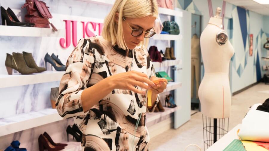
Well they started early with an unconventional materials challenge, so why not start early with a “sponsor” challenge? Season 15’s accessory wall is provided by JustFab.com and for the second challenge, the designers have been asked to design for the “everyday woman,” aka the JustFab customer. The winning look will be produced and sold on the website (with likely no residuals for the winner, btw). I can’t help but reflect on how “Project Runway” has shifted over the years from finding “America’s next great fashion designer” to “fashion for the masses.” It is only challenge number two and the designers are being asked to create a look for the JustFab customer, who is “everyone.” If you look at the clothing and accessories for sale on the website, it is quite bland and well, appealing to many on a very “basic” level. There are no risks taken, and there is little personality. Nothing is offensive. It is effectively “mall clothing” at best. Now… to ask a PR contestant to design for this company is actually effectively asking them to water their designs down. It is actually quite difficult to fulfill this challenge because as a designer one must have his/her distinct POV, but also appeal to the masses, which basically means the opposite!
The two designers who received more airtime than usual were Linda and Laurence. We get some insight into Laurence’s history, and what a touching story she shares about her family. I called Linda, whose airtime is more about her struggle with rib knit, as out early in the episode solely based on her airtime! Sadly, more often than not, when someone is featured as touting that they’ve got the challenge “in the bag” and is overly confident about their design, it’s a setup for failure (producer gold)!
LAURENCE took the win with her olive twill jumpsuit. I LOVE me a jumpsuit, but wish I loved this one a little more. I think it looked great from the front but the red slash/gusset down the center back didn’t do it for me. Still, it was executed well and had that “cool” factor, unlike many of the other entries this week. Sometimes it is hardest to achieve a “relaxed” look without the garment turning out like a paper bag.
RIK’s use of shirting and mix of check and stripe was playful with a dash of menswear. I like the idea, but feel the final dress was just okay. The choice to bare the midriff certainly limits the customer who can wear it. It was quite youthful.
ALEX chose to bare the midriff as well, but at least his look had some polish and sophistication. Certainly if he had won, that blouse would have been modified from its “runway” appeal for JustFab in order to be more wearable: not cropped, and perhaps the bow slightly smaller. He had every right to be proud of those trousers. Well done.
I love JENNI’s sarouel pant very much. Great choice in making it high-waisted, too. The styling is perfect, and though I don’t love that kooky shag-a-muffin jacket, it works here and has a distinct punch.
KIMBER received a low score for another look which had no personality. The swingy crop top (another crop top!) and flared pant with matching printed piping just felt dated and boring.
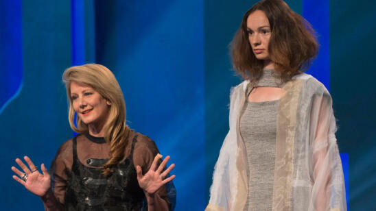
LINDA, even after struggling with the heather grey rib knit, stood behind her design. I don’t get why she so strongly feels that a knit dress is universally flattering (clearly it is not, even on a model). To make matters worse, she paired that sporty knit dress with a dressy organza coat. Who is wearing that and where to? Have to agree with the elimination on this one!
NATHALIA’s look was very on-trend at the moment: athleisure. This ensemble has a very “Alexander Wang” vibe. It’s cool and current.
SARAH was safe again with yet another forgettable look: a simple sleeveless floral blouse and black pencil skirt with no detail whatsoever. Talk about off-the-rack and mass appeal. What is her POV?
MAH-JING’s denim wrap dress was sharp and chic. Could have been a bit longer to be wearable. It was difficult to see if the model was wearing shorts (?) with it.
CORNELIUS’ combination of prints made my eyes bleed. There was way too much going on in the odd mix of patterns and the strange detail on the back of the bodice and geometric seaming. For me this week, there were a lot of designs I’d have put in the bottom (if there could be more than three), and this was one of them!
TASHA’s all-black look had a sloppy, haphazard feel. I guess I get where she was going with the mesh layering, but it could have been done so much better.
BRIK was in the bottom yet again this week for what I describe as a “poor man’s Armani” ensemble -circa 1996. There was nothing fresh and modern about the overall look, and clearly he has a thing for “crazy pants” because last week it was glitter and now it’s patterned knit. The look was also equally disjointed from the top to bottom as before. Let’s place bets: his days are numbered…
DEXTER was safe for his oversized/elongated flight jacket, which by the way I’ve seen in ALL the big box stores currently. It’s a knock off of a jacket my favorite cult denim brand R13 did last year. Just saying.
ROBERI’s ensemble made me think of Escada. It was feminine and unoffensive, but lacked any sort of direction. At least he made three pieces and there was solid effort there.
ERIN’s adorable dress (very MARNI) almost took the win again this week. I was skeptical of her choice to “embellish” those tabs in the workroom (as was Tim), but it really made the dress special and thoughtful, especially as they adjust to cinch in the waist for more shape if needed.


