I’m starting to think that instead of coming up with clever titles for each episode, I should just start naming them after the sponsor! Remember the good ’ol days when not every challenge had a sponsor attached or a gimmick? That said, I have come to expect the Heidi challenge, but it seems that almost each season she has a new line of product. It was the activewear for New Balance, then kids wear, lingerie, and now swim. When the challenge isn’t to design for her newest endeavor, it’s to design something for her to wear on the red carpet or a magazine cover. And of course I can’t neglect to mention the gimmick of Tim emerging in his own version of a “pool look”: swim trunks, a rash guard and a zinc-covered nose!
This challenge fuses the Heidi challenge with a print design. The designers are asked to design a print and utilize it in creating a swimsuit and cover-up for Heidi’s line (which is actually a division of her intimates collection, according to the website). As usual, the winning look will be produced and sold in her line, which may be good exposure for the winner, but let’s be honest, the winner could use some royalty money. How about a cash prize, since you didn’t have to pay a designer to do it? It’s just frustrating because trust me, as an emerging designer, with or without TV exposure, cash is very much needed to help get one’s business off the ground (and when you appear on “Project Runway” it is unpaid).
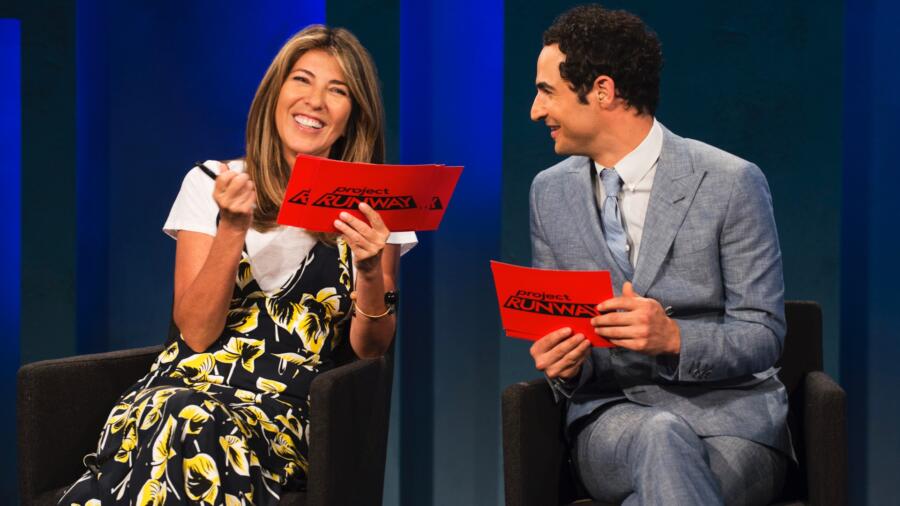
Challenge aside, what’s up with Heidi’s wardrobe choices lately? First I was thrown by the rather conservative looks (collared shirts, little sweaters, etc…) which appeared again in this episode, but WHAT is that leather leprechaun look?! It is already a bold choice to wear a bright green tight leather dress. But then to pair it with thigh-high green boots! I don’t know about you, but I found that outfit quite distracting and it was hard to take her seriously at times! I felt myself wishing the camera would have stayed on dreamy Lucky Blue Smith, the Mormon supermodel of the moment. I’m not sure what makes him qualified to judge “Project Runway,” but he sure is a beautiful specimen of a human to look at.
RIK redeemed himself big time. Straight away I loved his black and white optical print (shocker), which he called “Escher-inspired.” While my mind went to Gareth Pugh’s circa-2010-optical harlequin print (look it up and tell me you don’t agree), at first I felt it was very referential, but then again there really is no trademark on black and white optical prints. The bottom line is I love this look, especially the fact that he used the print head-to-toe, making his cover-up an easily removable wrap palazzo pant. Rick was very wise to take Heidi’s advice and lower the front and back necklines because we all know she likes to go there. Rik, I really hope you made that Speedo for yourself out of this print, too. Not going to argue with the win this week!
ERIN, who recently traveled to Mykonos (like all struggling designers do), said she set out to make a look suitable for a “sex bomb.” I’m not so sure the sweet color combination of red and pink says “sex bomb,” but the black edging and crisscross ties at the back gave it an edge and made it a little made it more so. Erin had immunity this week but ended up being safe anyway.
CORNELIUS was certainly sweating this challenge, feeling like a “fish out of water” (pun intended) designing a swimsuit. His print was neither here nor there but the cups on the swim top were a strange shape and not super flattering. The simple long black skirt as cover-up felt like a cop out.
NATHALIA made a fairly basic two-piece, but I thought her lilac/multi “techno” print was well-done. I also thought her cover-up was one of the more interesting ones because at least she didn’t make another simple skirt or kimono robe. Hers had an open back which was a subtle but effective detail. I’m interested to see what Nathalia does in a challenge in which she can’t use stretch fabrics and neoprene.
BRIK does brick. I’m not a fan of pink and red together, and it seems especially literal when used in this “brick” themed print. The print itself is underwhelming and anemic in design. Why not make it all multicolored so it reads more techno or at least has more impact? He tried to add some detail with a multi-strap on top but the top itself was not very flattering in its cut. I will say I liked his choice of oversized graphic print for the cover-up (if only his print had been this effective).
JENNI’s look was in the bottom two this week and gets the prize for spawning the best judges’ one-liners. The print, which exudes “yoga mat” (Nina), and “Miss Piggy meets ‘Golden Girls’” (Zac), is certainly a miss. I wonder if Jenni still stands behind this print now, having watched the episode back. Because what came to my mind was a ’60s shower curtain. Not only was it “grandma,” but the print itself was way too large a scale for a swimsuit. Had Sarah not made an even more inappropriate design for Heidi’s swim line, Jenni would have been out for sure. In fact I was half expecting this runway to have a double elimination.
LAURENCE also had a bit of a head-scratcher this week. Because of the scale of the large rainbow bullseye, her “print” was challenging to use because it had to be placed so strategically. I understand her concept but I would not even call this a print per se, because it has no repeat. It is actually more of a placed graphic, which would have been better suited as a screen print, and not so much on a swimsuit unless perhaps more of them had been used and overlapped cleverly or something. The fit and proportion of the suit was off as well–there were some gaping issues. I liked that her cover-up had a hood though.
ALEX’s somewhat overpraised look was certainly the most feminine of all the entries. Perhaps this is why it stood out to the judges. While I don’t necessarily argue that his look should have been a high scorer, for me it just fell a bit short because of the print and the construction of the suit. I give him major points for the cover-up, into which he had certainly put more thought into than his competitors–it could pass as a dress with the right closures and actually had some design to it. I like the fact that he was trying to appeal to a broad range of shapes and sizes, and I think he succeeded at that, but the blue piping down the princess seams looked a bit sloppy to me, and the leg line/crotch area a bit wonky in fit. In the end, I feel that (personal preference aside) while there is certainly a market for Alex’s boho look, Rik’s look works better with Heidi’s existing swimwear collection.
TASHA seemed very out of her element in this challenge. Not only was her print a bizarre choice for a swimsuit (odd colors, and too much negative space in between the printed areas), but the swim top was too small and not a great shape. Additionally, the solid black kimono cover-up was heavy (a lighter weight or sheer fabric, perhaps a mesh, was in order) and lacked interest.
MAH-JING got his mojo back. While the print and the suit were not particularly memorable, they were flattering and fit well. The scale of the print was good for the suit. I love the strappiness of the top but bottoms looked a bit large. Aside from that, it’s a totally sellable design.
DEXTER went with green (Heidi’s couleur du jour) for his print, but on close inspection of the print, all I could think of was a child’s rendition of Godzilla, blown up. It looks like hand-drawn green reptile scales. It’s just a bit bizarre (not in a good way) and I believe it would end up as an “outlet item.” That said, the fit and proportion of the suit was good. Dexter tried to do some pattern mixing and use a large scale print from Mood for his simple robe cover-up, but for me it wasn’t so compatible.
SARAH’s previous entries have been overly forgettable. This time, she let her hair down and went out on a limb. Unfortunately, the result was a juvenile print consisting of a drawing of a girl laying on a towel, which might appeal to a 10 year old, not to Heidi’s customers. Even the scale of the print was too large so the placement seemed jumbled. Sarah said she doesn’t go to the beach, so maybe this is what she imagines would be beach wear for her. I will say the bra fit well, but clearly there is a disconnect not only between Sarah and swimwear but also with Heidi’s brand, hence her elimination was imminent.
ROBERI was inspired by the macaw bird and designed a very effective feather print. What I like most about this print is that up close one can see the feathers, but from a distance, the print becomes an abstract kaleidoscope of color–he did a very good job with the repeat. The design of the suit is on-trend and super flattering. His red georgette cocoon cover up complements it perfectly and it all feels modern and cool. For me Roberi should have been in the top two.


