After last week’s surprise double elimination, six designers remain. It’s usually at this point in the competition that the avant-garde challenge comes up, a chance to think outside the box and push creative limits. While it’s a great opportunity for a designer to show his/her “chops,” it is also about four weeks into the competition and they are *tired*. It is hard to push one’s creativity to the limits when you’ve been under such extreme pressure for four weeks with little sleep and under such stress and duress. As I always say, creativity doesn’t have an “on/off” switch! I just remember being exhausted at this point.
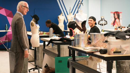
One of the show’s longer running sponsors, Lexus, is setting the tone and inspiration for the challenge by adding the additional twist of infusing unconventional materials (industrial “metal and machinery” elements) which remind us of cars. In an industrial warehouse setting, the designers select materials such as metal, mesh and hardware which have been preselected and staged for them. They are to merge these materials with fabrics from Mood, to create a bold avant-garde look. I always get a kick out of hearing (and seeing) what one’s interpretation of translation of avant-garde is. The term originated from an architectural style. When related to fashion, it basically means design which is exceptionally innovative and “outside the box.” It certainly walks a fine line between “runway” and “costume.” The competitors on “Project Runway” either get it or they don’t.
CORNELIUS is one of the designers who missed that mark. He barely escaped elimination with his costumey look which was just not attractive. While he did have a “concept” (parasite overtaking a woman), the goal here is still to make something attractive, no? His look -as only a man could design- was rather macabre in that it had several large duct tubes, one of which was originating from the abdomen/ uterus area. As the guest judge said, the placement was “unfortunate” (there were also 2 duct origin points near the derriere). Duct tubes aside, I was not a fan of the dress in general; it just wasn’t attractive. But it certainly was BOLD! I am still on the fence as to whether I’d have eliminated Cornelius or Mah-Jing…..it truly was neck in neck for weakest design.
MAH-JING was tied for bottom two/weakest design this week (for me), but ultimately was eliminated. Tim warned his look was too “costumey” and Mah-Jing made a comment to the effect of, “Isn’t that the point?” This is exactly the point of view I am referring to when I say a designer either gets it or he doesn’t. Mah-Jing doesn’t. He created some copper mesh and wire “poufs” and slapped them onto a rather basic dress in a dull charcoal fabric. Like Cornelius’ look, it came across as student work and not evolved or sophisticated.
RIK produced great work again this week. Was it truly “out of the box” and innovative? No. But it was the most attractive, expensive and wearable entry. In the end, those are usually the factors which sway the judges the most. And for that, I probably would have chosen Rik’s dress over Erin’s for the win. Of course, I wish his look had something a bit more to it. Perhaps it needed an accessory, a pair of pants or leggings….something else to push it out there. I know first hand that time is a huge factor in the competition, which is why I’ve always said “dresses are easy.” If he had made separates,or just something else, perhaps he could have won.
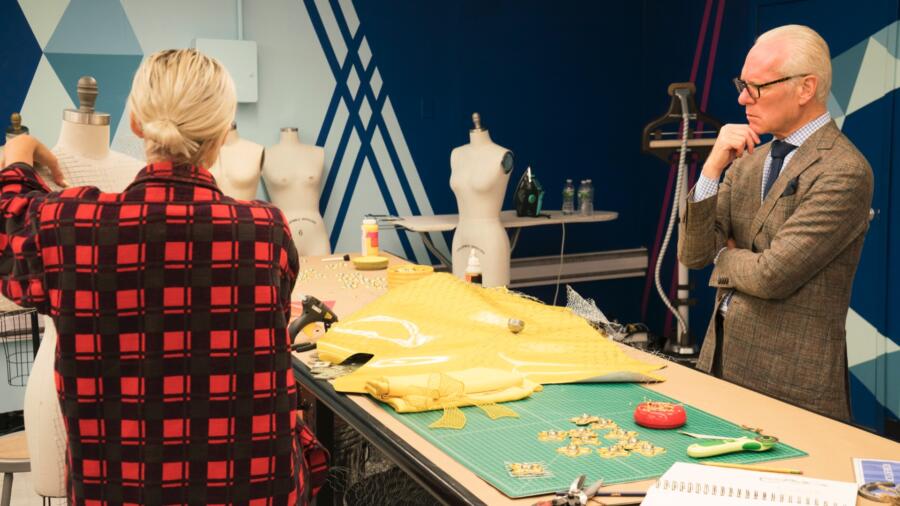
ERIN on the other hand (and opposite end of the spectrum from Rik), made YET ANOTHER look in yellow. While her look had some runway appeal and she is no doubt creative, the “signature” piece (paper doll apron thingy) felt like student work to me–some plastic flowers stuck onto chicken wire mesh. She definitely won points with judges for making a pair of palazzo pants. (The judges ALWAYS reward for making separates. See my comments on “dresses are easy” above!) I am not crazy about this look but compared to all the others on the runway, it had more impact.
LAURENCE’s black dress excited me when I saw it in the workroom, but unfortunately it lacked the “wow factor” that I was hoping for. The skirt should been longer to add drama. I think if she had made this dress into a long gown with “staircase” effect or even a long dramatic train (I cant believe I’m saying that because I don’t like trains), it would have had a higher score. I can relate though, to Laurence’s argument that this is HER style and what she has evolved into as a designer.
I could have looked at ROBERI’s sculptural dress for a long time. It was dynamic and thoughtful. I love the mixed metals he used and the proportions were great. This is also a situation where the one (small) addition of the shield covering the face made all the difference and made a strong statement when walking out on the runway. Like the judges, I was wishing for just a little more, not just a dress. But I appreciate Roberi’s artistic hand and he has a great eye for balance and relation of materials.
Next week it’s top five. Who will make the cut? It’s kind of obvious now to me.


