Each season there is a challenge driven and sponsored by the makeup sponsor. This week it’s the Mary Kay challenge and the parameters are to interpret an iconic fashion garment, and to use the New York skyline as inspiration. Finally, the winning designer gets a $5k prize! Now why don’t all the sponsors do this?
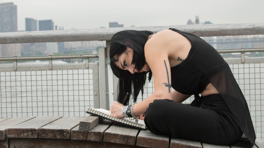
The designers sketch by the water, with the stunning Manhattan view in front of them. They then take their first trip to Mood, where they have $250 and a whopping 45 minutes to shop. I can’t recall ever having that much time in Mood — usually it’s only 30 minutes! It is very interesting to see how that $250 in materials translates later on…
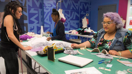
In the workroom we see typical struggles and challenges from several designers. Amanda is “freaking out” because she “has no idea what the judges want from her.” NEWS FLASH to anyone thinking about competing on “Project Runway”: probably the single most important thing you must do is stay true to your point of view. The judges want to see YOU in your work and original design. How many times have you heard Heidi say she likes something because she hasn’t seen it before? Not many, I know…haha… But she is always impressed when she sees something somewhat original. Let’s face it, fashion repeats itself and very little is truly “new,” but it is so important to have a clear vision as a designer. It’s a not a bad thing if not everyone loves your style — design is subjective, just like art. But before you go on “Project Runway,” make sure you can give a 60-second elevator speech about who you are as a designer and whom you are dressing. End rant.
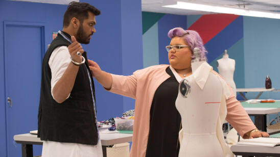
Gabrielle is “lost” and waiting for Tim’s critique. Not good. She is hesitating and that is costing her precious time. No wonder she couldn’t finish her garment. Of course everyone has their moments when they are “blocked” and that can become paralyzing, especially in a high pressure competition like this (been there). Sadly this train is not heading in a good direction. Honestly it was painful for me to watch because I can understand what she is going through, but at a certain point you just have to make it work!
BLAKE is very lucky this week. Though I like his design very much, his fabrication is awful. This is one of those episodes where the judging could spin a few different ways. I would not have given Blake the win because of poor construction. I do think the idea of this dress was great and if well-executed, could be fantastic. But since when has someone won a challenge with raw edges and straps jimmy-rigged in back with a piece of twill tape? On a personal note, I second Candice’s sentiment in the workroom, that it’s not becoming to pretend to be stupid, either.
KELLY’s very New York “cool girl” look was one of my favorites. I was happy to see she used her editing eye this week, as usually I think her designs have too much join on. I love the textile mix and the styling was spot on.
JOSEPH made a black dress that has been done ten times over. I don’t understand how this is New York-inspired, but at least it was well made and not quite as mumsy as last week’s look.
WHO is this LINDSEY girl and where is she going? This ensemble was sad, heavy and wilted. I don’t see New York one bit in this look. Everything is so off, from the fabrics to the proportions to the hair and makeup to the shoe choice. What is more disturbing is Lindsey does not understand that there is any problem with this outfit. It’s one thing to stand behind your design, but you also need to listen to a critique and grow from it.
ASHLEY’s dress is very “Ashley” and I like how she incorporated architectural style lines into it, from the skyline. I’m guessing she also thought about the color palette in steely tones to reflect that as well. Love the open back and how she echoed the same lines in the bodice in front and back.
LAURIE thought her look would be a top scorer. In my opinion she is lucky there were far worse designs. This is another look which was an eyesore to me, and too over the top. That said, it was well made. But the taste level….she thinks her girl is going to the office like this?! What sort of office would that be?
JAKE… why is he still in this competition? And why did he not end up in the bottom for this anemic look? All I could think was Forever 21. And that I could make that in a couple hours.
AMANDA is also hanging on by a mere thread. Having been in the bottom twice now, I am shocked she was not eliminated in this challenge. At least Gabrielle had a concept and made a jacket which is somewhat chic. Amanda’s “maternity-esque” dress did not say New York at all. It was sloppy and ill-fitting. She admitted she did not like her fabric, so why did she choose it in the first place? You have all of Mood to choose from and you pick that print? I can’t imagine she used more than $150 of her budget.
SWAPNIL is a winner in my eyes. His dress was inspired by “Breakfast at Tiffany’s,” an iconic film shot in New York. The balance was perfect — volume in front and bare in back. The fit was flawless as far as I could see, and it looked expensive and chic, yet playful like Audrey. This dress looked like it took days to make, not hours, like Blake’s. It was every bit as original, too.
MERLINE’s crazy coat look was every bit Merline. Not my favorite skirt, but it was all about the coat and again, totally original. Keep going, girl.
GABRIELLE is a great designer (check out her work on her website), so it is sad to see her eliminated. I think this was a mistake, but she really should have hustled more to at least try to finish the hem. The cute swing jacket had much potential but I don’t understand (and apparently neither does she) why she chose a white jersey for the dress underneath. She may have been able to save it by choosing a different silhouette for that dress, and certainly a different length. Then her styling didn’t do any favors either. Still, I would not have eliminated her before Amanda.
CANDICE earned a top score for her look, a very cool graphic jacket, white piped in black, which reminded me of some of the deco lines seen in New York architecture. She made a leatherette dress which was 100 percent Candice. I thought her look was great, but somehow I still just want to love her designs a bit more. I applaud her for having a distinct point of view though! She definitely knows who she is as a designer, and that will go far in the competition.
EDMOND decided to focus on a jacket, like many designers this week. However it had a bit too much going on. He was safe, but I think this was my least favorite look of his to date.


