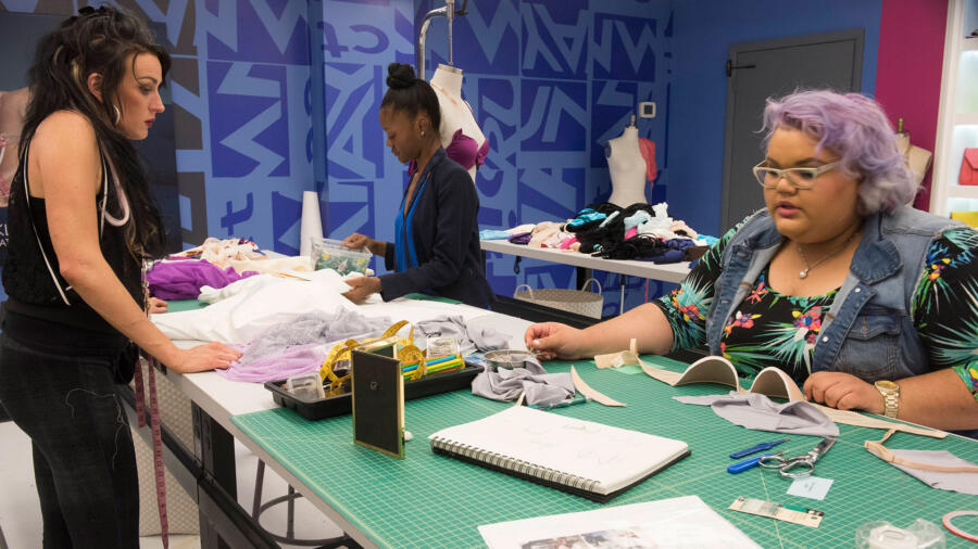
Ah, it’s the inevitable “HEIDI” challenge. On my season, we had to design a look for Heidi to (in theory) wear on the cover of Marie Claire. In other seasons, the designers have had to create a look for her New Balance activewear collection and for her children’s wear line. This time, things are a little sassier and a lot more challenging. Heidi has asked the designers to create a lingerie look for her HK intimates line. The winning look will be produced and sold as part of the line.
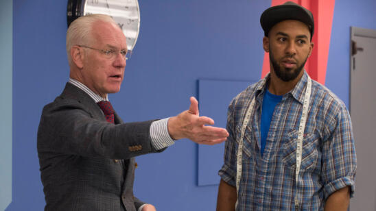
For those of you who aren’t familiar with what goes into making lingerie (especially a bra), it’s a LOT tougher than it looks. This is not swimwear–it’s a foundation designed to enhance a woman’s form and thus has major functionality. For Tim to state, “It doesn’t get more basic than a bra and panties,” is completely inaccurate and belittling the challenge. It is good that they were given a “basic” bra to use as a point of reference, but Tim warns not to simply slap on fabric and trims to redesign it. No shocker there when the designers are yet again given a bunch of fabric, lace and trim which has been preselected for them to use. It was not made clear where these materials came from. Was it HK Intimates, Mood, or…? The Mood mystery continues.
I recently had to shop for a lacy colored bra for a character in the show I am costuming for. I found that within the major department stores, the majority of bras were rather plain and more functional than showy. Lacy bras do not seem to be “on trend” in the intimates market. I just recall a couple years ago, there seemed to be a surplus of lacy and “impractical” styles within most lingerie departments and boutiques. I anded up having to go to low-end “stripper stores” and downtown LA to get what I needed. Even Victoria’s Secret didn’t have as much selection as I’d have thought. And then, ironically, I DID find a few colored lacy styles from the HK Intimates collection at Bloomingdale’s! I guess there still must be a market for colored lace after all. Thanks, Heidi! I thought I’d share this too, because the timing is such that I do have a pretty good sense of what her line is about, having recently seen it up close.
It is no surprise that for the most part, women tend to do better at these sorts of challenges than men. It is nothing against the guys, but simply put, we kind of get the anatomy a little better. I’ve always thought men design differently than women, not in a positive or negative light, but rather based on how they view women and each individual’s perception of their “muse.” I was a bit taken aback, as many were, at Blake’s reaction to this challenge. I mean come on dude. If you want to design women’s clothing, you shouldn’t be disgusted at the thought of women’s underwear. We all understand you haven’t made out with a girl. It has nothing to do with that! Put on your big boy pants now and stop wincing.
SWAPNIL pulled out all the stops for a real wow moment. His super-strappy “elegant bridal bondage” ensemble was fab. I am always impressed at how well he conceptualizes each of his looks. He is able to articulate his story and his “woman”, which is so important. This look is definitely more of a runway or boudoir look, and would not be something easy to produce at a mass level. Even the silk robe had drama.
I love ASHLEY’s lilac and grey color palette, and although everyone seems to have jumped on the “boob strap” bandwagon (zthis has been a lingerie trend for a while now–the bondage-esque straps above the cup.), I like these because they are thinner and more delicate. The cover up was a bit “meh” but hardly anyone did anything very interesting actually. Having seen the HK Intimates collection, I actually feel Ashley’s look was the best suited for her line.
Here we go again with JAKE’s lukewarm designs. Nothing to say here. Looks like a bra and panty set I saw at TJ Maxx. It just has no real “design.” And the sarong is a cop out.
EDMOND’s vision in grape is pretty underwhelming creatively. I know he can do better, so I’m just moving on. Besides, everyone has a meh week.
LINDSEY’s teal and peach color palette is pretty. I like the tap pant–it feels modern. Sadly, then Lindsey made an anemic-looking smock as a cover up.
CANDICE’s look was pretty predictable. The garter contraption is hot, but I could do without the lemon yellow(?) satin trim at the bust.
JOSEPH’S bra actually looks like it could have been straight off the rack, from HK’s collection. Not a bad entry, but also not too much design interest.
At last, something outside the box in MERLINE’s winning look. It walks the lingerie-to-fashion line and is cool and modern. It was pointed out that it the style is a bit limiting when it comes to bust sizes, but that’s perfect for me! I’d totally wear it. It does seem like it might not be cohesive with the rest of HK’s collection, but I’m not mad it this winning because I love the design.
BLAKE’s pepto-pink look, which got him eliminated, reflected his views on women’s underwear! The bra cup was extremely unflattering, and the “tanga” panty odd and outdated. He also used a sarong which (news flash) no woman wears as lingerie or to cover up lingerie, rather only for swimwear. It’s also a cop out as I mentioned earlier because it’s basically a yard of fabric tied at the hip.
LAURIE designed a rather dated ensemble which fit well. As Nina pointed out, the styling was really off, but I feel for the designers with such a limited selection of accessories. It can be very hard sometimes when everyone wants the same simple black pump or sandal, and sometimes you have no choice…that could have been what happened to her.
Last…and sort of least…KELLY’s look was simply underwhelming, and the cape was just odd and too short.
Congratulations, Merline! Now Heidi can make even more money off of you.


