It’s the first team challenge, sponsored by Celebrity Cruises. What I want to know, straight off the bat, is: why don’t the winners of the challenge receive a cruise?! It’s only fair, after being prompted to mention how amazing the cruise ship is!
The 14 designers are paired up in teams and select from one of the seven suitcases featuring a specific international destination from the Celebrity Cruises roster. This not only is to serve as inspiration for the look, but also contains pre-selected fabric out of which the look is to be made. The look must be “high end” and be able to go from day to night.
The designers open the suitcases and evaluate the fabrics. When they return to the workroom, there are supplementary solid colored fabrics provided by Mood. The biggest problem I have with this challenge is the fabric situation. Personally, I’m the kind of designer who is often inspired (or uninspired) by fabric, and believe it can make or break a design. It’s a real bummer to be limited by preselected fabric. The designers still have not been able to shop at Mood, and it’s already the third challenge. I’m wondering if there is something going on with Mood or the production behind the scenes, like a budget issue? Or maybe I’m just being a skeptic and it was more about not having the time to take the designers to Mood since they spent all morning on a cruise ship, and it is a one-day challenge. In any event, we see later in this challenge how the wrong fabric can greatly limit one’s design.
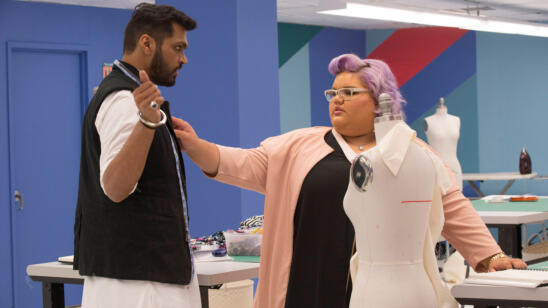
Team challenges are always a crap shoot. You never know who’s going to but heads, or in this season, not be able to communicate with each other, which is probably just as important as the design itself. If there is no communication, it shows in the work. When I was teamed up with Jay, everyone knew we didn’t get along. I tried to take the high road and just be professional. I’ve had to work with my share of difficult people throughout my career, so I know how to do what it takes to put the personal stuff aside. That said, we both clearly wanted the least amount of interaction with the other, and that attitude ultimately landed us in the bottom. Mind you, I had a higher-scoring design individually. Just saying. 🙂
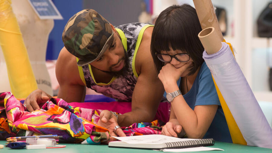
We saw this struggle with several teams, but two in particular: Lindsey and Jake, and (predominantly) Edmond and Hanmiao. The other designers described the latter as a “car crash” that you just couldn’t look away from, and I concur! I could feel that tension through the screen! Clearly Hanmiao had not had a collaborative experience before, because she seemed to really have a hard time from the start. Edmond tried to communicate and work together with her, but there was a double-whammy of poor communication skills with clashing approaches to design. The whole thing felt awkward, stressful, and frustrating for both designers. With Lindsey and Jake, it was a different sort of communication block, coupled with what I would describe as dealing with what I would describe as a “wet noodle”: Jake. So far in the competition he has not done anything interesting or even shown a distinct POV, so this comes as no surprise to me. What is unclear is how much of his side of the story is true (that Lindsey was calling all the shots), and how much he was…a wet noodle. Perhaps there are some details left out in editing.
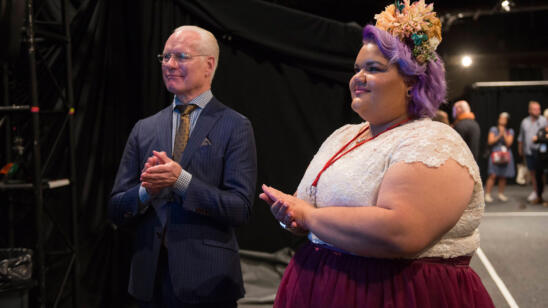
Let’s give a big round of applause for Tracee Ellis Ross as guest judge. Though she currently works as an actress, she has previous experience in the fashion industry as a model and contributing fashion editor to Mirabella and New York Magazine. It is clear she is a fashion enthusiast. I liked her comments and judging style. She definitely stands out as one of my favorite judges recently.
CANDICE and ASHLEY’s Venitian-inspired ensemble takes the win. There was a lot of thought that went into this look and their successful collaboration was evident. It definitely reads “Italy”, from the pattern mixing of the stripe and floral, to the palazzo pant which was very well-executed. The overall look was high end and elegant. My criticisms are the pants should have been longer or worn with flat sandals, and overall there was a bit too much volume, like in the droopy drapey back of the top. But these are things that could use just one more day to tweak. Brava, ladies!
SWAPNIL and LAURIE created a modern sari-inspired look for their India destination. This also reads high end and they were lucky with their textiles. Swapnil really has a great hand. I had a hard time with the fit of the trousers, though; on the one had I did not want the model to take off the Sari because they were such an eyesore; on the other hand, I wanted to see that great striped crop top! I like a drop crotch as well as Tracey but the pants were neither here nor there. I’m not so sure the intent was a drop crotch as much as this was a very ill-fitting high waisted pant. In any event I was happy for Laurie that her style muse liked their look.
LINDSEY and JAKE also earned a high score with their colorful Hong Kong-inspired look. I actually quite liked this, even though the red and green always take my mind to the holidays. Lindsey’s choice to make a sleeveless jacket (not a Kimono!) really pulled it together, even though the execution was just “okay.” That said, for one day and considering she had to work with Wet Noodle, I’d say it’s a job well done and was evocative of Hong Kong.
JOSEPH and MERLINE’s St. Petersburg destination was, ironically, evident in this look to me because when I visited Russia last year, I noticed many women are (a) rather conservative in their attire; (b) like metallics; and (c) wear a lot of dresses. HOWEVER this look was not at all modern, was poorly constructed, and was too simple. The asymmetry was off so it just looked janky. I’m not sure what happened with Merline’s voice coming though, and Joe’s accusation of her not working fast enough…that seems to be something lost in editing. So it’s a tough call as to who was more at fault for the look. Somehow though, it seems to me that Joseph should have been left up there on the runway in the bottom two for what was clearly his “marmy” design. We can now confirm that Joseph has NO qualms about throwing his teammate under the bus in front of the judges, right??
HANMIAO and EDMOND got a suitcase with supposed Caribbean fabrics inside. This is an example of when they really could have benefitted from selecting their own fabrics. Tim thought a swimsuit was appropriate but Nina thought it was contrived. On the one hand I feel it is the perfect way to design with their “destination” in mind, but on the other hand if you do not have the appropriate fabric, you must move on and “problem solve” to modify your design. The bright yellow maxi skirt did not help the unappealing print and bizarre “swimsuit” made of non-stretch cotton! The dynamic between Edmond and Hanmiao was indeed a train wreck. She should have stood her ground and insisted that she not make a swimsuit as they did not have the right textile; however, it seems as though Edmond got fed up with trying to work together and tried to save the sinking ship by attempting to scrap Hanmiao’s work altogether, which isn’t cool either. At least he tried, even having immunity. Hanmiao’s elimination seemed inevitable in this case.
AMANDA and GABRIELLE had the best intentions to try to make a clean, chic design which would evoke the South of France and not become patriotic, and I wanted to like this look but it just misses the mark. I like the idea of the top but it just wasn’t as well executed as it could have been. The pants had an odd leg shape as well. However I do not think it was as bad as the judges said; it simply recieved a lower score than Blake and Kelly’s look.
BLAKE and KELLY’s jumpsuit-dress hybrid certainly fit the challenge by conveying the Greek Isles. This look was right up Heidi’s alley! It is successful as something that could go day to night (especially in an island setting). My only criticism is it was too long.


