I can’t recall the last time we saw an episode with four designers left. And no twist! There seems to have been budget cuts all the way around for “Project Runway,” and though it is nice for the designer to travel for their final challenge, this episode left me feeling a bit “meh.” As a 15-year resident of Los Angeles, I felt there were so many more interesting places to have taken the designers. I understand that Best Western was locked in ages ago as the sponsor, so as soon as I found myself bitching about the fact that they stayed in a Best Western and not in one of the many fabulous hotels in LaLaLand, I thought, “Oh…yeah, they had no choice.” But to travel all that way and not visit a more “glamorous” place (since that was the theme of the challenge), or something more “Hollywood” (hence “red carpet”) seems a waste. Instead, the designers were brought up to a house in the hills (one of the producer’s, no doubt) with a view of L.A., as their source of inspiration. Sure it’s beautiful, but doesn’t exactly inspire glamour.
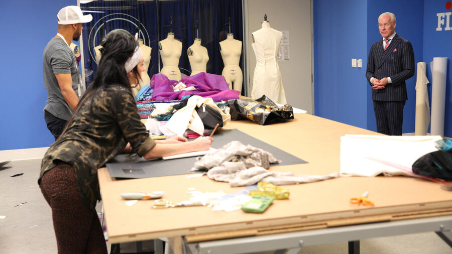
Former “Bachelor” contestant and now co-host of “The Insider,” Keltie Knight, gives the designers tips on how to create a successful red carpet look. Again, really? You couldn’t find an L.A.-based fashion designer or more notable actress who has been photographed on the red carpet many times to make an appearance and give the designers advice? Los Angeles is full of them. After sketching with a view, the designers shop for fabrics; they have a $400 budget at Mood in L.A. Then they use the workroom at FIDM in downtown Los Angeles to design and fabricate their looks. I guess the lack of inspiration caused everyone to choose sequins, thinking that is what glam means. Personally, I don’t know that I could derive adequate inspiration for a red carpet design in only a half hour of looking at a distant view of L.A. either.
ASHLEY has been trying to push herself more, including in this challenge. She says she is not comfortable doing gowns, which I can relate to. Unfortunately at this stage in the game, she needed to make it work more than ever. She chose a bronze-gold sequined fabric which has a “nap” in which you can flip the sequins to silver. I am very familiar with this fabric at Mood and though it is beautiful, it is not a great choice for a red carpet gown because it should if the sequins flipped randomly from sitting or walking, it could look strange in a photograph. I was actually expecting her to create her own abstract pattern in the sequin by “drawing” into it my flipping the sequins. As far as construction, there were definitely some issues in the bust but the idea was pretty great. It had a very Versace/Tom Ford feeling to it, in that it felt glamorous indeed, but with a little edge. I think the strap she had to add last minute actually worked visually, even though the bust still had some issues. The “slash” needed to be a bit shorter or more controlled. Still, the overall look of this gown (without technical difficulties) was probably my favorite of all of the entries Ashley was safe and we will see her full collection next week.
EDMOND made a fatal choice in his fabric selection. Somehow he was drawn to it at Mood, but such a loud, rather garish color and design is extremely limiting. There is not a whole lot to do with it, without “overdesigning.” If he had made a simple long gown, he would have been criticized for relying on the fabric too much. I honestly feel he did the best he could with the fabric. He made a fun dress, that was just simple enough but with a dramatic element (the capesleeves). The problem is he got scissor happy. He didn’t know when to stop cutting, and it ended up too short. It was painful to watch him doing that in the workroom because I knew what the result would be. This should be a lesson to all who are drawn like a magpie to fabrics that are complex or make a grand statement. I love fabrics with exuberance too, but just bear in mind that your actual design must become very simple to balance the complexity of the textile. I recall sort of struggling with this during my final collection on “Project Runway.” I fell in love with a Versace black and white paillette fabric and wanted to have a simple silhouette with some sort of contrasting detail. (I used black patent leather at the bodice.) Perhaps Edmond could have used a complimentary fabric to balance out the sequined one. Or perhaps, there was no saving this textile! It is tragic indeed, that Edmond was eliminated, after producing such good work on the show (and after trying out for the show each and every season, and making it this far). Somehow I feel this is where Tim will use his “save.” I think if this had not already been set up, someone else would have been eliminated and they would have kept Edmond. A critique can be spun many different ways you know!
KELLY has some travel in her future. She was awarded 100 nights in Best Western Hotels for winning this challenge. I give her props for creating her own textile. I give her props for making a jumpsuit, outside the “gown” box. I give her props for the fit, except that it was rather “catsuit”- like, i.e. sprayed on. I believe she used fabric with stretch, which would explain that. However I had a hard time loving this look. When she said her muse was Katy Perry at the VMAs, I understood it a bit more. But I have a hard time imaging anyone else wearing it. Is it just me?
CANDICE left me underwhelmed again. It’s a pretty gown that I could most certainly see someone wearing to the Oscars or Emmys. I love what she did with the sequined mesh in the back, creating a chevron. I like that she used mesh on the sides (though I could not see it), but honestly there needed to be something more. I don’t know that it would have been the mesh panels she ran by Tim (and he called them “trashy”), but…something else that had more of a signature or defining element. Thank goodness it was not a sweetheart neckline! The armholes on the front bodice really bugged me too, in that they were too “shaped”/scooped out.
SO…who’s betting that Edmond gets saved?


