The Unconventional Challenge comes early this season. This is definitely the first time we really see a designer’s “chops,” as in how creative, resourceful and tenacious he/she is. So much of making clothing is about problem solving, and the Unconventional Challenge is the epitome of that.
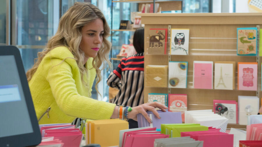
We also meet the first (likely of many) Season 14 sponsor, Hallmark. The designers are brought to a ginormous Hallmark card store in New York, where Tim and Amy (from Hallmark) deliver the challenge: Create a “wearable” look inspired by and using the Signature Collection cards, many of which have embellishments on them. Can you even imagine how many 5×7 cards or envelopes it is going to take to make an entire garment or two? A LOT.
As the designers start working, I am seeing that virtually everyone is using a muslin base. Now, I don’t really know how one could execute a garment using greeting cards otherwise, at least not in one day. However, I kind of have an issue with this particular “Unconventional Materials” challenge. The nature of the cards (and bits-n-bobs on them) as sole sources of materials means the designers are simply “embellishing” and covering up muslin, rather than actually manipulating various materials to form the garments, such as in the hardware store challenge, 99 cent store, etc… Of course, the muslin must be completely “masked,” so some designers use spray paint to do so, which also seems lame. I just think other sources for Unconventional Challenges are more interesting.
In the workroom, Edmond is really into the challenge and putting so much thought into his inspiration (a wedding card), that he doesn’t want to reveal “his hand” to anyone! I respect the fact that he is so focused…and it pays off. David, on the other hand, is “phoning home” in tears already…this is the kiss of death. And then there’s Blake, who pulls a Galliano. No, not stylistically; he throws a slur at Swapnil! Blake just needs a little bit of a reality check (pun intended), and a good dose of humility wouldn’t hurt either.
When the designers leave at midnight, there’s a whole lot of incomplete looks — I recall the feeling all too well of, “How the hell am I going to pull this off?!” and then somehow the next day, you just do. Adrenaline kicks in, you problem-solve, and it just happens. It’s not always pretty, or your best work, but it happens. And this time it happened with a lot of hot glue carnage, to be sure. And then you just pray the models don’t rip anything in the hour or so they are hanging out without the designer before filming the runway! (No! they don’t go straight there from the workroom as Tim leads the viewer to believe!)
SWAPNIL’s couture-inspired, magical dress almost looks like it walked off a European runway. He really used a great variety of elements form the cards, and took a risk combining so many elements. As Heidi said, “There’s a LOT going on…but it works.” I concur. There were so many great little details yet still wearable and harmonious. It also tells us who he is as a designer. To me this was one of the entries which really embodied the spirit of the challenge.
ASHLEY had a clear idea of making a poncho from the start. I love the fact that she was having go at outerwear, but unfortunately she did not use enough of the required materials and the result looks like a costume from a school play.
JOSEPH still isn’t showing me he has much of a distinct POV. This look has little personality and the skirt is way too stiff, resembling papier-maché; one of the points of the challenge was to make the material look more like real clothing.
What a shame DAVID did not utilize more of the materials, because he had a great idea making this cool oversized hoodie, which felt urban, contemporary, and the most like a garment someone would actually want to wear. He is much more of a relevant designer in general than Amanda, who had the other lowest score. It is a bummer that the judges eliminated David as he has a lot more potential than her. One can only wonder if Ashley would have been in the same position had she not had immunity.
JAKE’s work so far has been completely underwhelming. I have no idea what his POV is and his work in both challenges has been safe and rather forgettable.
CANDICE showed more promise as her design was underway in the workroom, but I was disappointed with the result, which looked too much like a dress out of a sci-fi B-movie.
HANMIAO sure has a thing for yellow. But her entry this time was much better. It was clean, well-executed, and charming. I am not a fan of the giant collar, though. I am kind of intrigued to see what else she comes up with; at least she has a unique point of view, and that could go either way.
I’m still trying to figure out who GABRIELLE is as a designer. I know it takes a few challenges, but this design was so vastly different from her last one. She strikes me as the Brooklyn-artsy-type. The dress reminded me of a painting or collage, which isn’t a bad thing, but in terms of the dress, I did not care for the shape of the “dip” in front.
This week it was LAURIE’s turn for the lopsided boob. This bodice was a mess and the skirt was just okay. The overall look was nothing too exciting and looked a bit like student work.
BLAKE might want to consider an internship with my friends at “Dancing With The Stars;” he seems to be obsessed with sparkles. I don’t understand why he was a top scorer for this mediocre design. It’s not horrible but over 50% of the garment was sprayed with glitter, was it not? I suppose it embodies the spirit of the greeting card, but still, nothing extraordinary. I did get a chuckle out of Amanda dogging his design by using too much glitter, while she was wearing her “GLITTER IS ALWAYS AN OPTION” t-shirt.
LINDSEY has created another odd, lackluster look. It prompted me to go to myLifetime.com and look up her portfolio, because I am a bit perplexed as to what sort of designer she is. It seems to me that Lindsey is not really a leader in style, but perhaps just obsessed with the 90s? If anyone can shed some light on this, please by all means comment below!
KELLY’s look is not my cup of tea, but it was well-executed, fun and a great use of the materials. I have a hard time with Kelly’s over-the-top, busy style, but I could see this look on a pop star, as the judges mentioned as well. I particularly like the little hooded crop top and the textile she created it out of. The fringe skirt reminded me too much of raffia or a hula skirt.
This was strike two for AMANDA, in my book, since I did not like her look at all last episode. I seriously question her taste, and it’s always off-putting when someone who has questionable taste is overly criticizing others’ work as she did (although the producers do try to pull it out of you). If there’s a look that should be featured on Ashley Tisdale’s blog, “The HAUTE MESS”, it’s this one! How does a female designer not know that one should never, EVER, augment the hip area with volume?! Aside from that, there are just way too many elements happening in this look. She should have just made the black “lace” effect the highlight of the outfit. If it were up to me, I’d have eliminated her for this design. You can’t learn good taste.
I’m a fan of MERLINE’s hyper-architectural style. I know it is not for everyone, and is not always wearable, but I respond to it personally and appreciate that she is very true to her distinct POV. This look was not as strong as her last one, but I can’t wait to see what she does next. I found Amanda’s “manatee penis” descriptive of Merline’s look to be completely absurd and ignorant! The detail is more of a reference to ancient Egyptian belts and can be seen in some soldiers’ armor. Where did she even come up with that and how does she know what a manatee penis looks like?!
EDMOND hit it out of the park on this winning look. He had a clear idea of what he was going to make and the result is very impressive for one day! Not only is the gown beautifully done, but I love that he used so many different white materials. He definitely gets bonus points for using the Hallmark Signature printed parts of the back of the cards, and he even had time to make a bouquet! Way to go. My only question is what did he use for the giant petals for the skirt? I did not see any seams from piecing together envelopes, etc…
Overall there seem to be a lot of designers this season who don’t have much of a “signature.” I hope to see the ones who do, stay around longest. Usually this is what the judges look for as well.


