This week, the “Project Runway” designers found out that creating swimwear is not easy. Most designers who have worked in the industry know this already, but many people outside of the fashion world think it is just the opposite: it’s only a small piece of fabric and it stretches, no need for much construction… easy-breezy right? Not so much. There’s a reason why swimsuits can go for $100 or more. It’s all in the minutiae and labor involved in those precise details including binding, piping, wiring, shrinking, and stretching fabrication. In addition, it takes at least 5-10 fittings per garment to finalize a proper swimsuit fit. Only a small group of the designers succeeded this week in taking the plunge into swimwear while others really sank to the bottom! Let’s recap…
We join the remaining designers commiserating in their apartments. The boys are spending the morning killing mosquitoes, Rik wants to prove that he’s not a “tacky-tacky” designer, Cornelius is still Shady McShady, and Nathalia is trash-talking Erin’s design from last week saying that she only sees “Grandma’s wearing it.” (Note to Nathalia: Grandma chic IS what’s happening now. Hello Alessandro Michele for Gucci.) Last but not least, Sarah says that her stuff has been “getting better and better” and it’s her “time to shine… I am a contender!” With those statements, I sadly think this is a bad premonition and that she’s going home this week. We’ll see.
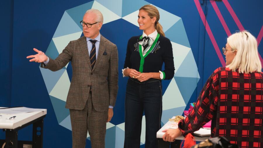
Back on the runway stage, Heidi greets the designers, cryptically telling them that they are “ready to take the plunge and dive into their next challenge.” She summons Tim Gunn, who walks out in swim trunks, long sleeve t-shirt (with pocket hankie, of course), towel, and sneakers. A group of swimsuit-clad models then appear, officially putting an exclamation onto what they are doing next: swimwear! The challenge is to create a swimsuit and cover-up inspired by the Heidi Klum Swim line. In addition, they are to design their own custom print. The winner will have their look reproduced and sold as part of Heidi’s line and once again, no word on any of the profits going to the designer. But they do get bragging rights!
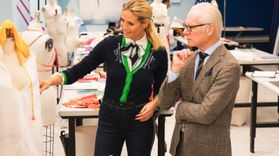
After surveying the Heidi Klum Swim dossier and having some sketching time, the designers subsequently create their own prints with the aid of Kornit Allegro/Digital and Papilio Prints (say that five times fast!). Post-Mood shopping they’re back in the workroom, having received their already finished printed textiles (boy was that a quick turnover!). Tim and Heidi eventually visit them for the check-ins. Every time there’s a challenge that involves Heidi, the designers are always scared, which I think is funny since she is so sweet. But understandably, sometimes she might be more critical with her judgment since it is, after all, her brand on the line.
Heidi was all smiles with Alex. She likes the print even though Tim thought the design looked a bit “gymnastic.” She’s scared of Dexter’s big alligator eye print and doesn’t like Cornelius’ high-waisted swimsuit bottoms or the “H” clip in the center front of the bust. For some unknown reason, Mah-Jing is using denim, for both his swimsuit and cover-up, and Heidi wonders why. She deems Roberi’s macaw-inspired print “very sophisticated” and thinks Sarah’s sunbathing girl print is cute. She also loves Rik’s black and white geo print with Tim chiming in, saying that it’s “smashing.” Finally, Nathalia’s design is considered very juvenile and Jenni’s—on the opposite age range—very “older woman.” It’s not just looking mumsy, it’s also looking a bit vintage store costumey, and not in a good way. Jenni cannot understand why Heidi doesn’t like her cover-up. Sometimes, you really need to just detach yourself emotionally from your design. It’s not easy.
The rest of the workday is spent with designers panicking, continually complaining how they are not swimsuit designers, or having—as Erin says—labia spillage problems. I never thought in my almost decade-long history of writing these recaps that I would ever… ever… write “labia spillage.” And now I’ve done it twice.
Runway day and the guest judge is model/musician/author Lucky Blue Smith. The old grandpa in me had to ask “Who?” Naturally I did as old grandpas do: I Googled him and found out he’s only 18 years old, from Utah, was named “Model of the Year” by Teen Vogue in 2015 and (wait for it!) has 2.6 million Instagram followers. Okey dokey. Now, here is my take on the good designs:
I liked Erin’s print and especially the sexy strap detail of her swimsuit. It may not have screamed Mykonos (her inspiration), but I did get “gay man’s sassy best girlfriend!” Nathalia’s swimsuit was okay but I liked her flowy cover-up more. Brik’s was surf girl cute. Dexter’s (surprisingly) turned out fine and it ended up looking more tropical fab as opposed to scary reptile. Roberi’s side cut-out, one-piece design was chic and I did like his print. I agree with Nina that I wish it would have been larger feathers. Where I didn’t agree with the judges was with his red silk cover-up. I was not a fan. It reminded me of a boudoir robe and not something a woman would wear at 10 am in Positano on the way to the beach. Alex’s swimsuit and cover-up were successful—especially the latter—but lacked the “wow” factor that Rik, the eventual winner, had. Rik’s was marvelous from head to toe. The print was impacting, sophisticated and polished. Congrats to Rik for rebounding from last week’s hoochielicious stripper creation to a stylish, modern design.
And now, the uh oh: Laurence’s cover-up was hip-hop fab but the swimsuit was just plain weird. Tasha’s was a trifecta of “oopsie” design: the bikini, print and cover-up were a mess. The top was too teeny-tiny, you could barely tell what the print was (Rasta lite?) and the black color for a beach cover-up was a fail. Her look was saved by the styling, however. I did love those JustFab.com gladiator sandals! But there were two worse: Jenni and Sarah. Jenni did not end up detaching herself from the design that Heidi originally was not a fan of back in the workroom and guess what happened? No one else liked it as well. It looked over-designed and gimmicky, as well as “mature.” In the end, the judges thought Sarah was the least successful. My hunch earlier that she would be in trouble after saying that this was her time “to shine,” unfortunately turned out to be correct (darn my hunches!). Her design and print were considered too “junior” and lacking any style. Personally, I liked Sarah’s sunbathing girl print but it was definitely lacking a “wow” factor. I thought Jenni’s was worse in terms of its overall look, but once again, over-design beat out under-design. Swimwear might not be in Sarah’s future, but hopefully she has enough of that print left to make a cute little dress for herself!


