Ugh! I feel like this season was made for me! I would seriously love to be a contestant!
This week, the designers learn that they are going to be making swimwear and will be able to design their own print. These are both things (swimwear and print design) that I recently did a lot of with my own line. A very much “real world” challenge.
Dexter makes a great point when he states that the print making is so important. If the print does not work, the entire look will not work no matter how flattering the design and cut of the suit.
I was so very impressed when Tim announced that the fabric would be ready when the designers returned from Mood. That is a LOT of fabric to print! What I was a little less impressed by was when the designers returned from Mood and showcased their fabric. Did Brik really say that he was inspired by/obsessed with bricks as he showcased a brick print? This is worrisome. Oh, then there is the scale of Jenni’s mandala print. It looks too big to be showcased well for swimwear. So far, nothing else really captures my eye at the moment.
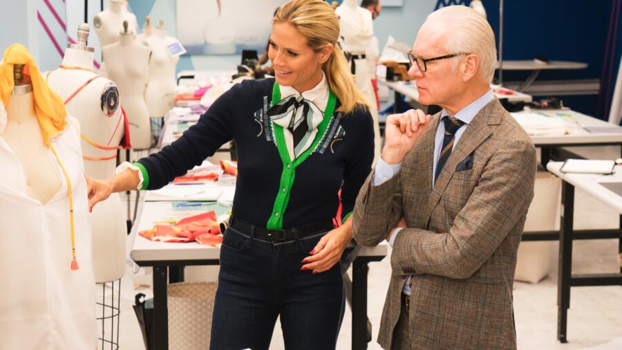
Tim states that Heidi will be coming around for the critique. This should be interesting because she does not hold back on her opinion. I am very concerned for Cornelius, and it seems that Heidi shares my concern. His print is not exciting and the silhouette is unflattering. I understand that he has never done swimwear before, but as a designer you should have a taste level and a skill level that should carry your through any competition. I disagree with Heidi about Dexter’s design. I think it is fun and very reminisent of Jeremy Scott. I just think that it is not Heidi’s style. I also disagree with Heidi about Jenni’s look. Although I am not in love with the print, I think the ’70s vibe of the pant is great and the swimsuit is well-constructed. I also thought the cut of the swimsuit was flattering. I do agree with her about Rik’s geometric print and the exciting potential it has.
My heart goes out to Tasha. I know how stressful it can be when you are having one of those days, nothing is working right and you just have to try to do your best with the amount of time that you have. I like her attitude compared to Cornelius, who is also stressing out, but could be working or brainstorming with all the time that he is complaining.
On to the runway:
Rik – I like this print and that he used it for both the swimsuit and the cover-up. Unfortunately, I do not think the design of the swimsuit is very unique. I like the tearaway pants, but not sure they are enough to bring the look to the top three.
Erin – Wow, Erin has done it again! I am so impressed with her! I love the print and use of it in the cover-up. I love and appreciate the interesting cut of the swimsuit. I love the long skirt with the high slit. (It looks so similar to skirts I made for my resort collection, so understandable!) She paid attention to details with the cool buckle on the skirt and having the tie of the swimsuit match the trendy choker. Bravo! I think this should definitely be in the top three!
Cornelius – Unfortunately, this had to follow Erin. It looked like a dumbed-down version. The skirt was not as well-made nor interesting, the bathing suit was ill-fitting and too basic and the print was juvenile. I can see this belonging in the bottom three.
Nathalia – I agree with Nathalia that the print looks a lot better from far away because it looks a mess up close. That is about the only nice thing that I can say about this look. The swimsuit is a very basic design and not interesting. The cover-up looks like a mess. There is the white at the bottom, which is the border around the print, i.e. not hemmed or finished at all.
Brik – I have to admit that I was impressed by this look. The print looked much better from far away, and the swimsuit was a cute and sporty cut. The cover-up was easy, and I love the print he chose to compliment his swimsuit.
Jenni – Hats off to Jenni for sticking by her look. She updated the bottoms to be really cool with the thin, strappy sides, plus, the cover-up was really creative in how it transformed from pants to a skirt. Heidi looked impressed at the improvements.
Laurence – I was a little surprised but Laurence this challenge. This outfit looks so different from her previous looks. I am not crazy about the bullseye print, the too short cover-up or the cut of the swimsuit. The lines of all the pieces were not flattering, and it was a departure from her normal flattering, chic pieces.
Alex – I really like the “hippie” vibe he created in the cover-up. It looks easy, flowy and flattering. I think he did a great job mixing the print with the trim and white fabric. I am not as excited about the swimsuit. The trim looks a little uneven and the silhouette is not that unique. I also think he could have done more interesting things with mixing the prints.
Tasha – I was impressed with the way that she was able to pull this look together. The swimsuit is super tiny,but luckily it looked very flattering on her model. The cover-up was a little too simple, but worked with the swimsuit. It was also styled well with the lace up shoes. This was not a great or exceptional design, but the model carried it well. I think she has a decent chance to be safe.
Mah-Jing – Another design that pulled it together for the runway. He scraped the heavy denim fabric and went with just the red denim, added to the majority of the printed fabric he designed. The cover-up was nothing exceptional but, the swimsuit was very flattering from both the front and the back. The back having the unique lacing that was beautiful, in my opinion.
Dexter – Dexter did a great job of taking Heidi’s feedback to create something that still had the feel that he was going for, but making it a little more commercially successful. I would have liked to see the print without the white lines, and would have preferred a little more uniqueness to the silhouette. The cover=up was nothing too special, but I did love the way he incorporated the additional print and colors.
Sarah – This was probably one of my least favorite looks, but I have to really give it to her for creating such a well-made and well-fitting bikini. Her model had a little more of a womanly figure then a lot of the models, and Sarah made a swimsuit that really flattered and supported her. I don’t have much good to say about the cover-up, but it is finished, which a lot of the designers failed to do. I think her construction will be her saving grace this challenge.
Roberi – This is one of my favorite prints. I love the feathers, the scale and how the color pallet looked on the model. I also thought the shape of the swimsuit was beautiful, although I thought he could have made the leg opening a little higher to be a little more flattering, and maybe a little more support on top. The cover-up could not have been more boring or basic, but it did allow the swimsuit to take center stage.
I believe Erin was the clear winner, while Nathalia, should be sent home. The judges were not on the same page as me as Rik was crowned the winner and Sarah was send home despite her excellent construction.


