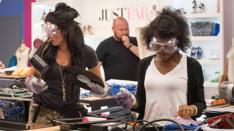
Week 7 and another unconventional challenge. Last week I said that I didn’t think the designers were challenged enough then this week more than makes up for it. The designers are told that they are going to have to create a garment made entirely out of trash from looks like the 90’s. Old floppy disks, Polaroids and and many others that have been thrown into the technology graveyard. While this challenge seems extremely exciting I can definitely empathize with the designers as all of these materials look extremely difficult to work with and to mold. I think this challenge will really start to prove who is a serious designer and who has slid by in the competition so far.
Back at the workroom we learn that Jake’s dog is dying. After tearfully explaining the situation to Tim Gunn he then lets the workroom know that he has decided to leave. I understand that a lot of people think that he gave up too soon, however being on that show and knowing how emotional and high stress the situation, is I can totally understand wanting to remove yourself when something like that happens. I also totally get the relationship with your dog or pet. I remember when I was on “Project Runway All Stars,” leaving my dog was the hardest part of the competition. (I didn’t have a baby yet!) I believe if I had gotten the same news as Jake, I probably would’ve made the exact same situation.
While Jake decides to leave, Swapnil is taking himself out of the competition in a different sort of way. He is taking lots of breaks and told people that his goal is to be safe and then try to work really hard towards the end of the competition when it’s his point to shine. I have heard other designer say, “Oh, I just want to be safe now.” My issue is that you want the judges the fall love with you and see your work so that if something does go wrong with a later design, you at least have that history to go on. Also you are a national television. This is your point to show how talented you are as a designer. Why would you not take every single opportunity to do that?!
It is hard to see what is going on with the workroom except that many of the designers are struggling with the materials as projected. It’s hard for me to make any speculations of what designs I think are going to stand out, so I will just hop right in to the runway.
Swapnil – The construction is horrible on this garment and you can tell that it wasn’t entirely thought out. That said, it is also evident that he is a talented designer. The lines are interesting, it is something unique and ultimately while this might have him wind up in the bottom, I think designers are going to want to see more of him. I’m not too worried about him going home.
Edmond – This look turned out great. The fringe is modern, the cut of the dress is nice and the use of black keys to make a design was impressive. While I have always been a fan of Edmond as a person, his designs have never really impressed me until this. I think he is more in the running for Fashion Week than I gave him credit.
Lindsey – This is my least favorite dress and my vote on who should be sent home. It looks like a dress for a junior high formal. There is nothing overly creative or interesting about it, and the creativity seems to be consistent with the designs she has put out in the past.
Candice – I really like this dress and think it deserves to be in the top. She did a great job of organizing the wires to create a beautiful and figure-flattering design. My only complaint is the use of color. I don’t like that the white was only used at the bust.
Laurie – This look should be at the bottom. The skirt is not flattering and the top makes no sense. The awkward slit in the middle of the stomach is also not flattering and makes it seem like the whole outfit is not constructed well.
Kelly – I agree that Kelly made an interesting textile and the dress definitely looks like something that is ready to wear. However, the actual design of the dress is very basic and I do not see this being a winning design.
Merline – I appreciate the dark and edgy feel of this look, but I think that it could’ve been better done. The fit was an amazing and it looks like some wires are coming off. Her styling with the minimal makeup and slickedback hair that almost gave an alien look definitely helped.
Joseph – I like this look. It was simple and easy, but overworked. I understand why this look is in bottom compared to other designs in the competition. However, this look does not seem like it should be the reason a designer goes home.
Ashley – I really like how Ashley developed her own textile using Polaroids. She kept the design simple and really let the textile shine. And the silhouette is definitely more interesting and on trend than Kelly’s.


