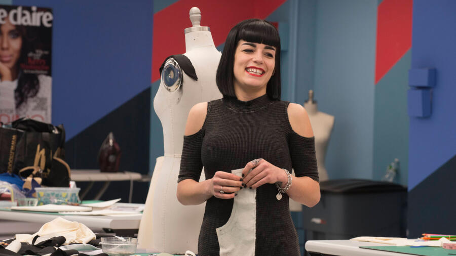
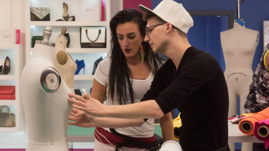
Well, this episode starts out with a bang! Or more correctly, a clang. The designers all think that they are being summoned to a classroom. They are halfway right, because when they arrive at the workroom, it is equipped with desks and a large chalkboard. On the chalkboard is five general descriptions of women. The assignment: each are to design a look that fits their given description. Candice, being the winner of the last challenge, gets not only to choose first, but also decide who gets what description. I admit, I’m a little concerned. We have seen her “mean girl” side after all, turning on Ashley. I have a suspicion that she might try and give the designers their worst match up. Although she tries to play the “nice girl,” she ends up coming off slightly condescending and arrogant. Candice starts off with informing Merline that there is a side of Merline that only Candice knows, and that “obviously” Edmond’s pick must be the Bombshell, despite his own protestations.
After a trip to Mood and some suitable work time, Tim comes in for a critique. It is evident in his feedback that he is indeed underwhelmed. And I have to agree. There was a complete lack of creativity. It was like the designers just Googled their description and then designed the first thing that came to their mind. You know it is a bad sign when the designer that gets the most praise is Kelly. Tim then states that there is an additional surprise! It ends up a slight disappointment, seeing as it is just another product plug–this time for a Brother machine that can print things directly on t-shirts. The designers just have to design a label and then wear it.
At this point I just have to state that I love Edmond and Merline. They both have the most positive attitudes and are always supporting the other designers. I fall even more in love with Merline after learning that she has a nonprofit that works with children and design. In general all the designers have been surprisingly very supportive of each other, but these two really shine.
On to the Runway:
Swapnil – Ugh, the tight cheetah dress for the bombshell. Could he be any more cliché?! I think the jacket, made last minute, is the most successful part of the garment. The back looks like a hot mess, seeming like it was just thrown together. I think the look would have been more successful if he had just left the back open. His plan to stay safe until the end is backfiring. Has he has gotten used to not giving 100 percent? I think so, and it is stating to show.
Kelly – Could this look be more Forever 21? I can’t imagine paying more than $20 for the entire look. We have seen so many fur vests recently and hers is not even done particularly well. I think the fur baby vests I make for my Lilias and Love line are more on trend! And babies should not be more stylish than a runway look! The jersey outfit in mixed media has also been done before and done better. I wish I liked Kelly’s style more because I think she is a really sweet girl!
Merline – She hit the nail on the head with her description of her garment. But, it was not constructed well….at all. She did think outside the box with her unique design, though. Unfortunately, that can only save you so many times on this show and with only seven designers left, she really needs to make sure she is succeeding in both design and construction. (That goes for any competitor.) That said, I loved the innovative use of mesh and I hope that she gets recognized for her creativity.
Candice – Wow! She keeps getting better and better! I LOVE this look and thought that it was the clear winner. I think the strongest part is the oversized lapels. I love her use of stripes to make the black more playful. I also thought the skirt was a lot of fun and the perfect on-trend length! I have nothing negative to say about this look.
Ashley – I was a little disappointed in this look. I was hoping for a stronger showing from Ashley after last week’s big flop. The skirt and top have been done a million times before, and in a lot better print. The jacket was slightly interesting, but I have to say that it definitely looked like pleather and would have been more successful and on-trend if it was oversized.
Laurie – Yawwnnn. I understand that there was a classic inspiration for the look, but we have seen a basic pencil skirt and chiffon top just too, too many times. This has become an unfortunate trend among the designers on this challenge! I could see Nina doing everything she could to hold back her eye roll as it walked down the runway. Laurie really should have stepped up her game at this point in the competition.
Edmond – I like the direction that he took with this look and think it is a LOT better then the first design he had. However, I think he should have pushed it further. I believe it could have really been a stand out piece with a lower back and more intricate macramé on both the back and front. That said, his model looked killer in the dress and worked it down the runway.
I couldn’t help but feel frustrated along with the judges. The designers were told to create something “high fashion” and not just something that was “online ready.” I feel like they just rewarded the designers that went super basic. What do you think?!
In the end there were no big surprises as Laurie went home and Edmond won.


