Creating a day-to-night look can be a difficult task for any fashion designer. Sometimes, it’s an accessory that does the trick, while other times, it can be an entire outfit that by virtue of its design, silhouette and fabrication, makes it right for 2 pm as well as 8 pm. This week, “Project Runway” challenged the remaining designers with such a task of creating a day-to-night look, but with a twist…
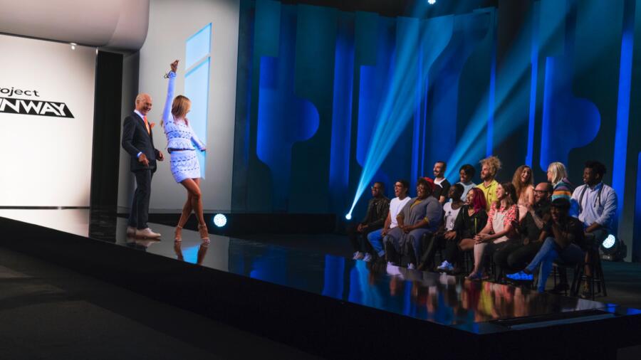
As the designers gather to take their seats next to the runway stage, Heidi and Tim suddenly yank on supersized light switch. In a split second, the runway goes from day to blacklight and neon-like colors are revealed on our hosting duo. Just as some of the designers were asking themselves if they are designing outfits for a 90’s rave club, La Klum and El Gunn shut any utterances of ecstasy by announcing what the actual challenge is. Tim tells the designers that “Project Runway” wants to take the concept of day-to-night dressing to another level. The challenge is to create an outfit that can transition from daylight to blacklight. The design should initially be “daytime appropriate” in regular light, but once the UV light is turned on, it’s a completely different story.
The designers head to the workroom which has been outfitted with special supplies such as puffy paints, flashlights and ultraviolet reactive materials, as well as a separate blacklight room. Tim greets the designers with Sherrianne James VP of Marketing, Transitions Optical. James announces that the winner of the challenge will get to appear with their design in a Marie Claire photo spread. Okay, I have to give “Project Runway” props for workin’ hard to (almost) seamlessly and innovatively bring a sponsor into a day-to-night challenge. Whoever thought of this one really deserves a special “sponsor tie-in” trophy. Transitions Optical meets transitional fashion. Done and done.
After their Mood trip, the designers dive deep into their creations. Tim comes in for his check-ins. Of the designers that seem to be doing okay, Tim is intrigued by Erin’s sweet-by-day/naughty-in-blacklight baby doll dress. Tim is “electrified” by Roberi’s swirling volants. When he showed it in blacklight, it glowed to stunning effect. Tim thought Rik’s silver top design was a fabulous look but was questionable of what he was making to accompany it. Personally, I think it looks more stripper Barbie and less gladiator queen. Cornelius first wants to spray paint onto sections of his dress but following Tim’s critique, gets an idea to add emojis that hopefully will pop when exposed to the UV light. While at first, I’m thinking this might be questionable, I quickly think it could potentially be Moschino/Jeremy Scott fab.
Of the designers who seem to be struggling, Kimber heads the list with her printed and white creation. You know you are in trouble when you call your own design “ugly.” He thinks Nathalia’s color-blocked creation is looking like a costume from “Tron” and says that Brik’s is not very pretty. If you think our dear Tim Gunn has taken a “tell me how you really feel” truth serum for this week, wait until he gets to Mah-Jing. Mah-Jing is very eager to explain that he is making a daylight-to-blacklight wedding dress for his loving fiancée. While the inspiration is endearing, Tim says it is “a construction mess.” And if that weren’t enough, adds the two nails to the critique coffin, by demanding that Mah-Jing, “Get rid of it,” and, “Just scrap it!” Double ouch. Previously, we were treated to a very emotional happy Father’s Day call in which Mah-Jing spoke—and (understandably) cried and cried—with his fiancée and daughter. Once again, the jaded side of me immediately thinks, “Uh Oh, he’s in trouble this week!”
While watching, I am still a bit dubious about most of the looks I’m seeing. Most of the designers’ creations are looking like a DIY art fair hot mess. It doesn’t help that several of them have had to start all over again and the stress level seems to be higher than usual. I am sure it will all be resolved on runway day. How I still fall for the editing is beyond me (Kudos to the editors).
Runway day is here and the stress continues. Jenni’s puffy paint flowers are peeling off and Mah-Jing’s bad luck streak continues when he discovers that a supposedly transparent-in-daylight dye turned a not-so-transparent pink under the UV. Actress/designer Jaime King is on hand to guest judge the “Project Runway” DIY art fair—I mean, daylight-to-blacklight transitional challenge. While preparing to give my two cents on the designs, I remind myself of the original concept—an outfit that transitions from daytime fabulousness to blacklight party time.
My favorites were Erin and Cornelius, with Jenni a questionable third. I’ll start with Jenni. While I get how Jenni’s was one of the better designs, I am not sure I would have put her so high, only because her daylight offering did not look so daywear in my eyes—unless she was going to the drag beach party in Mykonos. I loved Erin’s design. She wanted to show a transition from a sweet little angel to a naughty girl and she achieved it without sacrificing taste, elegance or style. While many of the other designs looked junior high school arts project adjacent, hers whispered sophistication and high fashion, especially with her sequined appliqué work. Cornelius’ emoji dress was great. I especially liked his Bjork-haired, doctor-by-day/party-girl-at-night inspiration. His sexy white below the knee sheath dress was adequate for lunch at The Ritz but when the blacklight turned on, it was, as Nina said, a “phenomenal transformation.” Between these two, Erin got the win. I know we are only in the third episode, but she is definitely, as Zac said, in a “league of her own.” Now if I had any quivers about who deserved to win, they were laid to rest when Cornelius began his Bitchy McBitchy commentary following the announcement. What a sore loser. Why do I feel the urge to slap him upside the head?!
And now, the bottom. Let me start with saying that I was not a fan of Rik’s. It was tacky, hoochie and tasteless. (OMG, what was with the butt-baring openings?) The look had no semblance of what any woman would wear in the day, unless she was making a walk of shame after a night out pole dancing. If I didn’t have any previous knowledge of his past two creations, which were great, I would have put him at the very bottom. I’m sure Heidi, Nina and Zac were thinking the same thing as they let him slip by. Mah-Jing and Kimber were the lowest vote-getters. Poor Mah-Jing did not have it easy in this challenge and his final design showed the struggles. Under the daylight, it wasn’t that bad. It was when the light changed that it resembled a motel bed sheet under the glare of a UV light. In the end, it was Kimber who didn’t shine under the blacklight. I thought her design was okay and appropriate for a day look, but it lacked excitement and design innovation. For this, she went home. Once again, overdesign trumps underdesign. Even though Mah-Jing’s dress might have looked like a “CSI” crime scene under the UV light, at least it looked like something. Kimber’s was—for the judges—nothing. Note to future “Project Runway” contestants: no matter how bad, something will always succeed over nothing.


