”Pretty.” “Feminine.” “Perfect for a red carpet event.” These were all comments from the judges to some of the creations that came down the runway in this week’s episode. There’s only a teeny-tiny problem: these SHOULDN’T BE the comments you want to hear when critiquing an avant-garde challenge. But here we were. This week’s challenge is always supposed to be a highlight of the “Project Runway” season, showcasing the limitless level of creativity that the designers can achieve. Sadly, this wasn’t the case. What happened? How did four out of the five designers get it so avant-garde wrong, and more importantly, what Kool-Aid were the judges drinking? Time to investigate and recap.
The episode begins with the top five designers, Edmond being the only male left. They discuss Swapnil (who was given the auf last week) and what a shame that he gave up so soon. I know that there’s a lot of web chatter about Swapnil and whether or not he was edited to seem unproductive. However, the fact that these designers are reiterating the “he gave up” narrative, makes me think that, in fact, it wasn’t editing.
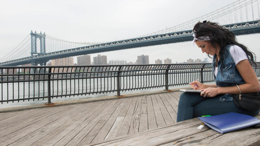
Heidi meets up with the designers on the runway stage, telling them that for the next challenge that “they are going to bring some NY landmarks to life…in 3D!” as she puts on a pair of 3D glasses. The designers join Tim at a location overlooking the Queensboro Bridge to introduce the challenge: Create an avant-garde design inspired by an iconic NYC bridge. Each designer gets a bridge: Kelly, who won last week, chooses the Brooklyn Bridge;,Candice and Merline get the Queensboro, and Edmond and Ashley are given the Manhattan Bridge.
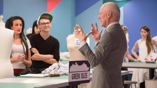
In addition to the bridge inspiration, Tim tells the designers that since bridges are multidimensional, their designs must be as well. To that end, they will be using 3D printing with the aid of 3D Systems and Cube 3D printers. Annie Shaw, creative director of 3D Systems is on hand to explain how the 3D printing works using the designers’ sketches. The best part is Tim’s announcement that the winner of the challenge will receive their own Cube 3D printer. I know I sound like a teenager but, how cool is that?!
Post Mood shopping, the designers are in their workroom beginning their two-day creations. Now before we go any further, when I first heard “avant-garde challenge inspired by bridges,” all I thought was this is Merline’s challenge to lose. Merline studied architecture and her designs tend to go in a directional, semi-avant-garde route.
On the second day, the designer’s 3D prints are done. Earlier this year, I was in Vegas to host an event at the CES/computer electronics show and saw some fashions created using this technology and the technology wowed me then and it wows me now in this episode. The so-called prints remind me of a new form of “jeweled” appliqué, the sequins of the future!
Tim checks in on the designers. Candice is inspired by triangle shapes in the Queensboro. She came up with six different designs for her 3D prints to incorporate into a gown. Tim says it’s “very compelling.” Ashley’s design is inspired by the wires on the Manhattan Bridge and is making separates. Edmond is using the “X” structures of his bridge as a catalyst for his creation. Merline says she’s using the “swoop” of her bridge as a point of departure. She’s doing a folding technique to make a skirt that looks eerily similar to Kini Zamora’s “umbrella” avant-garde design from last season. Tim doesn’t point that out, but he is concerned by the unevenness of the construction.
Finally, Kelly is creating a look inspired by the structures that support the bridge on the ground and doing a panier-like shape. If any designer in the workroom was doing something remotely avant-garde, it would be Kelly, because I frankly do not see avant-garde in any of the other designs. At the end of his visit, Tim proclaims that this is the “best work they’ve done all season!”.Are you sure Tim? Because, I’d walk that back a few steps. I was actually waiting for him to reprise his “Swapnil 200 percent” statement about not pushing themselves enough. That would have been my mentor two cents. More avant-garde…and pronto!
Runway day and Heidi Klum’s “America’s Got Talent” bestie, Mel B is on hand as the guest judge. Now I love me some Mel B, but I fear that it might have been more appropriate to have Dita Von Teese or Grace Jones (I know, wishful thinking) or at least, designer Thom Browne or Hussein Chalayan. I know, even more wishful thinking. But I’m guessing someone like that may have more knowledge as to what avant-garde should look like. The designs come out and one by one, it’s NOT avant-garde. Except for Kelly, of course.
First off, Edmond’s black gown is pretty and Heidi quickly says, “It’s the PERFECT DRESS for a red carpet event!” Seriously Heidi? That would be fine if it was A RED CARPET CHALLENGE, but it’s not. Thank goodness Nina says what I was yelling at the TV.
Ashley is beyond proud that she made pants. Well, at least it’s a change from a pleated circle skirt. But it’s not a PANT CHALLENGE. And the pants were rippling at the inseam and rise, a sign that they were, say it with me kids, too tight. She also makes a crop top (her second go-to staple) plus a “dramatic” cape that is less Elie Saab and more church choir. (Thank you, Edmond!) Yet Zac praises her and says, “You really stepped it up!” From what? If Zac thinks this is stepping it up, I fear the judges have IMMENSLY lowered their standards.
Candice’s design of a red zibeline mermaid-shaped dress was, as Heidi said, “A stunning gown from head to toe.” But Heidi, THAT’S NOT THE POINT! It was nice that Mel B said she would wear it at a red carpet event, but I think Gareth Pugh, Viktor & Rolf or Rei Kawakuwo of Comme des Garcons might take offense to one of their avant-garde designs being appropriate for the red carpet. What I am saying here is that, it wasn’t avant-garde. But it was pretty and elegant. I give her that.
Kelly’s design was the only creation that could be considered avant-garde. Yes it was a more literal interpretation of the bridge inspiration, but it was jarring, provocative and the judges somewhat redeemed themselves when they appropriately gave her the win. I was happy when she won because she deserved it. It turns out this was Kelly’s challenge all along. She proved that she is the only designer left that had enough creativity to win an avant-garde challenge.
And finally, the bottom. In terms of all the non-avant-garde designs, Merline’s was the biggest disappointment. As I said in the beginning, this was HER CHALLENGE to lose. And lo and behold, she lost it. She created a basic crew-neck bodice with waist darts (Design School 101), and then attached a skirt with exaggerated folds. What is avant-garde about that? In terms of the judging, she certainly wasn’t the least avant-garde design on the runway, but that didn’t seem to be the judging criteria this week. The other designers went for “pretty and sexy” and that seemed to be enough to please the judges. I did love, however, how she was such a GREAT sport about being out. Club #Five. It’s been a long time, over ten years, and many of you may not remember where I ended up in Season 2, but…welcome to the #Five club, Merline. Bienvenue.


