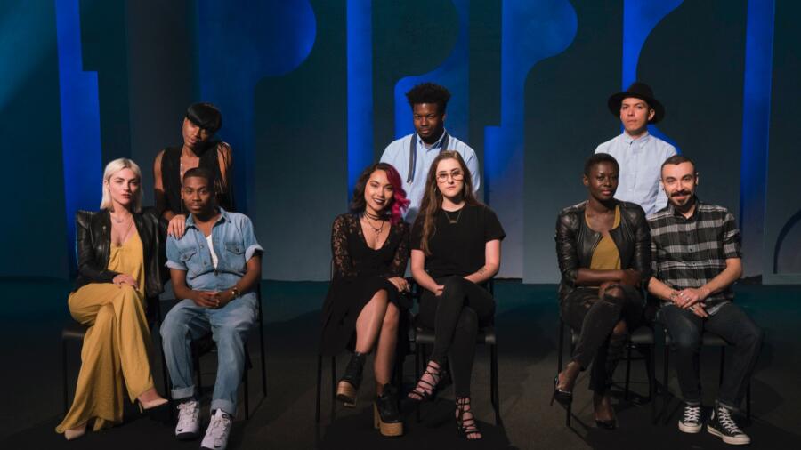
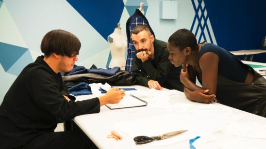
This season seems to be more “clique-centric” than previous ones, or perhaps I’m just noticing it more and the cliques which are forming seem to be pretty intense.
This “color-centric” challenge is led by the lead hairstylist of Sally Beauty who has assigned three color stories (trends in beauty, I suppose?): red violet, “new neutral” and blue. The designers are to work in three teams of three, and produce three-look collections, each based on one of these palettes. These collections will be judged partially by the public in a pop up shop setting in Manhattan. The public vote on their favorite collection while viewing them through store-window- like display. Their vote only counts for 20 percent of the overall judging though.
As the teams are selected (via the “velvet bag”), there are two people in particular who feel immediately like “outsiders” on their teams: Cornelius and Mah-Jing (each one of them literally used this word in confessionals). Cornelius must work with Erin and Dexter, who are total “mean girl” besties at this point. They basically think they will both be in the finals and maybe after the show is over they’ll start a line together. They are unapologetically vocal about how much better they are then their competitors. It’s no doubt Cornelius is dreading working with them, and sure enough they appear to be leaving him out of much of the “team” process. [Sidebar: could Erin become a villain this season? I could not help think she looked a bit sinister and harder on runway day, without glasses and wearing a leather jacket and some dark lipstick. Food for thought!]
Mah-Jing is certainly an odd pairing with Jenni and Nathalia, who both have much different styles than he does. This is certainly not the first time this has happened in 15 seasons of “Project Runway,” but nevertheless he is feeling alienated from the team process.
The focus again is on Sally Beauty, who is sponsoring this challenge; the hair director works with the teams to create looks reflecting their individual color stories. WHY, oh why, would anyone put color in the hair to match the outfit?! Newsflash: Halloween is over! And that look is NOT chic. That said, I actually liked the red team hair effect of spraying graphic “bands” of color onto the hair—very Patrick Nagel! However, it should not have been the same color as the collection as that takes it to a costumey, gimmicky place.
TEAM RED seemed to be going for a punk theme when they started conceptualizing in the workroom. I thought this had a lot of promise since not only is punk very on-trend right now, but it could have had a wow factor on the runway. Trouble is, the collection lacked the “hutzpah” that one expects from a punk-inspired collection. When Tim came in for his critique, the styling twists which occurred, such as breaking up Cornelius’ red plaid suit, seemed to bring them together briefly, but ultimately this created more work and the collection suffered for it. I have to say I am not a fan of Cornelius’ look: the jacket looks like it has red electrical tape down the front (could be a cool detail but misses), but the overall style is quite basic and conservative. The pleated skirt was just a mess—this was rather ambitious in such a short time, after this skirt was taken for Erin’s coat (in his defense, he did get boned there). Dexter’s dress was not as offensive to me as to the judges. I thought the sleeves were interesting. Still, it did not speak “punk.” Erin’s sweet spot seems to be coats, for sure. This one was no exception. She does often seem to come up with clever details, such as the exterior pockets. The look was definitely complemented by Cornelius’ plaid skirt. This team ended up with lowest scores, and Cornelius was eliminated. Tim swoops in and uses his TG SAVE™ because he truly felt Cornelius was bullied. Aww.
TEAM NEUTRAL was shockingly the fan favorite. As was alluded to during the episode, this was not enough for them to win, because it only counts for 20 percent of the vote and the judges had given them pretty low scores. This collection had some very retro elements to it, which, when combined with the rather lackluster palette they received, just ended up looking sad, strange, and imbalanced. Even Tim said it in the critique: it was looking “blah” and they needed to raise the bar. I feel these colors needed to be translated into either hyper-modern or super luxe (a la “The Row”) looks. The very Kardashian-esque color story could have been a more beautiful study of “nudes,” but those are tricky and their fabric selection was off as well.
TEAM BLUE had the winning collection by far. Not only was the collection extremely cohesive, it literally felt like three looks had been taken from a 30-look collection by the same company/ designer, but each look was great on its own. The use of plaid was risky, but really paid off. What the team did with it was super cool and it tied the three looks together. One of the standout pieces was Roberi’s leather and plaid asymmetric skirt, which he paired with a simple graphic sweater. The judges agreed and gave him the win. Hooray for Roberi, who has been one of my early favorites. Another great piece was Rik’s trench, which had so many interesting details yet was not over-designed. Laurence’s slouchy perfection was on point again with another amazing pair of trousers paired with a “swag” t-shirt and cropped jacket. Her look was the most simple of the three, and perhaps the weakest, but still leagues better than many looks from the other teams. The entire collection felt fresh, modern and on trend.


