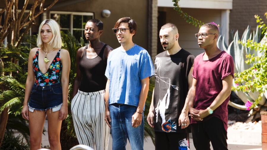
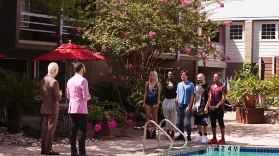
For the final elimination challenge before the “collection” phase, the producers are giving the designers a “change of scenery” by taking them to Austin, TX, where they meet PR alum Nick Verreos at…..wait for it….the pool at the Best Western. What does the Best Western have to do with it? Nothing (aside from being a repeat PR sponsor), except to provide a meeting place and award the winner of the challenge with 50 free nights at any of their locations .(I wonder if that is limited to the US? Hellloooo Europe!) Apparently Austin’s slogan is “Keep Austin Weird,” which I had always thought was proprietary to Portland. In any case, having hailed from Texas originally myself, I never really thought of Austin as “weird.” Eclectic, perhaps, and certainly not without some serious southern roots. So in line with the theme, the designers are asked to source materials from Georgetown Farm Supply and Stubbs BBQ to create another “high fashion” unconventional materials look out of random Texas stuff.
There sure is a lot of random stuff at a farm supply, and Erin is all over it (dried worms, anyone?), like a kid in a candy store. Laurence and Rik predictably make a beeline towards the leather bridles and harnesses (can’t say I blame them), and of ALL the things under that roof, Cornelius selects hundreds of dinosaur-shaped three-dimensional dog treats. I am familiar with the treats he selected–I have bought them for my dogs before–and they are akin to a hard dried giant pasta shell, but thicker. I knew this was a recipe for disaster…
Back in the workroom, some designers are fully underway with their looks, while others have been struggling. However since it’s a two-day challenge, they are not panicking yet (that’s all about to change). Cornelius, of the latter category, has had to completely scrap his dog treat themed plan, and is creatively paralyzed. Cut to… Tim announces there will be a second part to the challenge! Just when you thought you might be for once have a tiny bit more time to actually think through your look, NOPE! The designers must now create a second look to be made only with Mood-sourced materials, to complement the unconventional one. Sorry, but this is just lame. Inevitably these looks will appear as “after thoughts.” Tim kept saying, “I am VERY concerned about your time!” Well, what do you expect?!
On another note, somehow I thought the designers might stay in Austin to create their looks. When they entered the workroom after returning from there, I could not help think that the next morning (which is when they would have started filming), they should have had their ideas fairly mapped out. They were filming in Austin, selected their materials, packed them up, flew back to NY, and went back to their apartment. (The producers held onto the materials and deliver them to the workroom at each designer’s work station.) My point is that typically for each challenge, you have 30 minutes to sketch (while cameras are all over you), then you travel to Mood, have 30 minutes to pick out fabrics, then travel back to the workroom, then GO. It’s not much time to digest your ideas (and that’s the point). But in this case, the designers literally got to “sleep on it”, a rare advantage in the “Project Runway” Land. These are just things I think about that you viewers might not realize!
ERIN received rave reviews again for her unconventional materials dress, in which she combined gold spray-painted meal worms with guitar picks to create flowers which she encrusted the bodice with (combined with other elements). While the silhouette is different than previous ones she has done, I felt the flowers were redundant. I certainly give her props for being a “craft master.” But at a certain point, it’s all about the embellishment for her and not much more. However, this is her “brand.” In any case, I found the proportions of this dress really off: the bodice came up too high onto the chest,and the skirt was too short. The second look did not feel cohesive. The print choice was fun, but the silhouette itself was rather “meh.” But like I said, how much can one really put into that second look?
I had an new epiphany about RIK this week as I saw his looks evolving in the workroom: he reminded me of Seth Aaron a bit, stylistically. I actually think Rik has a slightly more evolved aesthetic than SA, but when he was showing his second look to Tim in the workroom, it seemed so “simple” and slightly 1950s in style, yet he was trying to “edge it up.” They also both like to use punk and bondage references, yet it somehow comes out a bit watered down or a bit mall-like. I just had an aha moment there. Do you see it as well? That said, his two looks were very cohesive. The unconventional look was well made and chic, but I felt as some of the judging panel did that he could have pushed it a bit further.
LAURENCE’s look was the most high-fashion to me. I am obsessed with the way she used the leather strapping in an artful and asymmetric way, and it was a very smart choice not to use black. The dress reminded me a bit of Alaia. I do think the skirt looked a bit messy, but then at times I’d look at it and think it wasn’t so bad. As far as her second look, she knew it wasn’t great, and I am not a fan either. I don’t care at all for the goldenrod yellow knit paired with brown leather. The look could have been much richer had it been a more creamy neutral shade. I’m glad she made it through to fashion week though, and look forward to seeing what she does for a collection.
I was VERY concerned when I saw ROBERI’s macrame developing in the workroom. I thought it would look crafty and anemic, even though I can appreciate his vision and tenacity. Then I was even more scared when I saw him make a nude spanx-type underpinning; thank goodness he did not need to use it. The final result was another artful creation from him. It is hard to believe he achieved that in (basically) one day. His second look was an excellent use of combining textiles, something for which he has a great eye. The two looks may not have been so cohesive, but believable enough in terms of coming from the same designer. Roberi won this challenge, likely for having two strong looks; his second look did not feel like merely an afterthought.
CORNELIUS was (not surprisingly) eliminated. His unconventional look was not high fashion enough, and while it wasn’t an eyesore, it just felt like a craft project or any other unconventional challenge in which the designer simply embellishes a basic silhouette. His dog treat plan went awry so he took plastic cups and made flat multi-colored flowers out of them and stuck them all over the foundation. Sadly it did come across as desperate move, which it was. The second look, while equally “unoffensive,” was not at all cohesive with the unconventional look, and again the addition of gold embellishments to the sleeves of a black jumpsuit was a bit random.
Hooray for home visits next week. Conspiracy theory: since it has been determined that Erin excels the most in unconventional materials with her art school background, do you think the choice to have two of such challenges in a row (pretty unusual) was to favor her? She established herself as a judge and producer favorite from early on. Just more deep thoughts!


