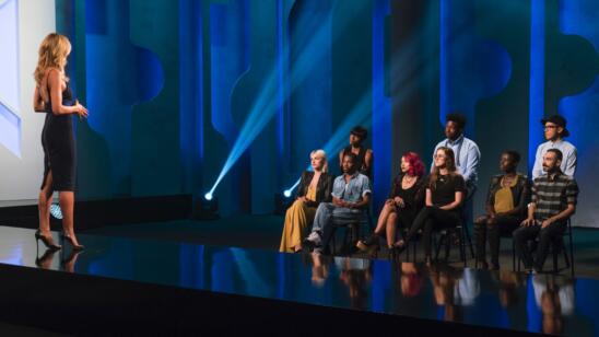
This weeks episode begins with the designers talking about the past challenge, and how they are in a very talented group. Of course Nathalia and Cornelius are talking how they deserve to be in the top. I can’t help but wonder why they feel they are so entitled to be there. I haven’t seen any great work from either of them to validate these comments.
Next we go to a helicopter pad, where the designers are met by Tim and the editor-in-chief of Marie Claire magazine, Anne Fulenwider. They are instructed they will each be taking helicopter rides over New York City to get inspired by the views for their next challenge: to design for a “powerful woman.” Again, yet another amazing challenge for the designers to have a once in a lifetime experience! In past seasons I tend to get annoyed with the designers calling each challenge “life-changing”–it feels a little forced and trying to promote the challenge. This season, well, there has been none of that. The experiences have been some of the most unique.
When the designers get back from Mood the first thing that I notice is Cornelius’ different colors of leather. I am a little concerned about this. I think that bright colored leather can look a little cheap, and I don’t have great faith in his taste level. On the other side of the workroom though, I am really inspired by the print that Rik is making. It feels very cool, unique and very “New York.” I am a little concerned with Erin’s look. I don’t think “waves” is a great descriptive of New York and that the jacket is a bit too literal of that inspiration. I am hoping that she pulls it together. I do think she is really talented based on her designs earlier this season. I wonder if she is spending too much time becoming Dexter’s BFF and not enough time working.
Tim comes around for an early critique, allowing the designers more time to work later in the day. The look that catches my eye the most is Laurence’s look, which has the skyline in the hem of the top. What a cool and unique way to pay homage to NYC! I couldn’t help but laugh when Rik mentions that Erin’s look is reminiscent of Patrick from SpongeBob SquarePants! Then Tim just adds insult to injury by stating that it looks like a milk carton. I am glad she seems to agree and that she is willing to rework it, after calling it a labia! LOL The hilarious insults continue when Dexter says that Rik’s dress looks like its covered in poop. I believe his words were something along the line of, “It looks like a seagull went to town on the dress.” LOL
I am also noticing that Nathalia keeps asking Rik for help and that she seems to have zero confidence in her work. I can understand where she is coming from–she is young and the whole PR process is very overwhelming. You are working around the clock, get little sleep, your stress level is high, and when a design isn’t working for you, there is literally no time to turn it around. It can be really hard to be under that amount of pressure. I am impressed by how helpful these designers are with each other and that Rik helps pull Nathalia to the finish.
Moving onto the runway I am really unsure of who will be in the bottom and who will be sent home. It seem like all the designers were able to pull it together.
Dexter – I like this look. I think the dress could have been a little longer to add drama. I also like the jacket, but I think that he could have pushed it a little further. Making it longer, changing the shoulders, adding more trim or ties could make it seem a little more polished and unique from his prior jacket.
Nathalia – She ended up pulling this look together. It looks great from far away but, up close you can see the construction issues, and cheap material. I also think the jacket looks a little overworked, it would have been more successful with less fabrications and shapes. I would have just focused on making a killer jumpsuit in the blue with the blue shiny detailing.
Roberi – I really like this look. It is not the first thing I think of when I think of NYC, but I like that he stayed true to his style. I love how the dress flows, and the unique placement of chiffon. This would be a dress that I would love to wear.
Mah-Jing – I am very impressed with him this challenge. The dress is beautifully patterned and extremely unique. It is constructed well and fits the model like a glove. My only complain are the fabric choices. I don’t understand the tweed and denim combination for this garment or for the inspiration. I think it would have been a lot stronger in different fabrics.
Cornelius – I really feel bad for talking so poorly of Cornelius earlier. He killed this look. It does look classic and sophisticated, with a really fun element of the detailed leather panels. He proved that he deserves to be here, and this look deserves to be in the top. I could see many fashion editors wearing this.
Laurence – This is one of my least favorite looks from Laurence. She is a talented designer with excellent taste, so it still looks great but not at the level of her other designs. There is nothing too unique about this look, with the exception of the skyline detail at the hem of the top, but that is lost with the full skirt.
Erin – I hate to say it because I was really pulling for Erin, but I really don’t like this dress. The blue ruffle at the hem seems very juvenile, the length was not flattering in that heavy fabric and the top was lacking some unique patterning. It breaks my heart because I have seen how talented she is, but I think this dress might send her home.
Rik – I love the idea this look, but I have a major concern with the draping. I do not understand why he didn’t make the front of the dress the back and vice versa. I would have loved seeing the pop of white, black belt and flash of legs in the front. He did a great job creating the fabric and a beautiful dress, but it needed to be reversed!
Cornelius was crowned the winner of this challenge and he is no longer the only designer left who has not won a challenge. It was a very deserving win. I was totally off with the judges about Erin’s look, and she was in the top instead of the bottom. Nathalia was sent home, as well as Dexter.
I was really surprised by this.
While I did think that Nathalia deserved to go home, I did not think that Dexter deserved to leave. He has shown such great work in the past, and I didn’t think his look for this challenge was enough to negate that. I will really miss watching him each week, with the humor and fashion he brought to the show.


